The Tam O'Shanter Inn – Los Angeles Update 3.

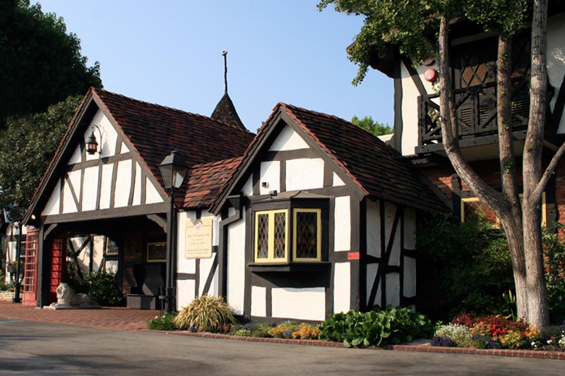
My last stop in the Los Angeles area before heading home was The Tam O'Shanter Inn. This famous Scottish pub has the distinction of being Los Angeles' oldest restaurant operated by the same family in the same location.

I wasn't even aware of the significance of the place, thematically, until I read the short entry about it in Chris Nichols' fantastic book, The Leisure Architecture of Wayne McAllister. The subject of the book himself was a noteworthy early practitioner of thematic design, but The Tam O'Shanter was mentioned only in passing because McAllister was called in at some point to enlarge and remodel the restaurant.

What caught my eye reading about McAllister was a small, seemingly insignificant fact—The Tam O'Shanter was Walt Disney's favorite Los Angeles restaurant dating back to the earliest days of his animation studio.

Why would Walt like this one restaurant so much that his studio regularly donated art to hang on its walls? It was enough to intrigue me to stop by.

As it turns out, The Tam O'Shanter Inn has a long history, and it provides one of the earliest examples of twentieth century thematic design. The general manager was kind enough to allow me to take numerous photos photos of the interior, and provided me with a history write-up that they give to patrons. From the handout: "In June, 1922, Walter Van de Kamp and his son-in-law, Lawrence L. Frank partnered with restaurateur Joe Montgomery to co-found a quaint restaurant and roadside stop. Initially called 'Montgomery's Country Inn' the name was changed to The Tam O'Shanter in 1925."

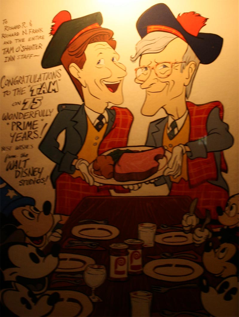
There is a nice display cabinet in the entrance lobby to the restaurant, showcasing many old photographs and assorted memorabilia from over the years. The Tam O'Shanter name, incidentally, comes from The Poem by Robert Burns (1759–1796), widely considered to be the national poet of Scotland.

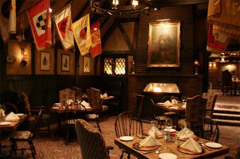
You would think, given the decor, that this place is just another pub-style restaurant and bar.

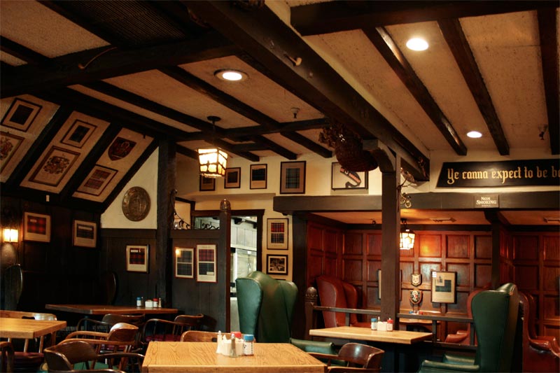
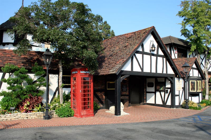
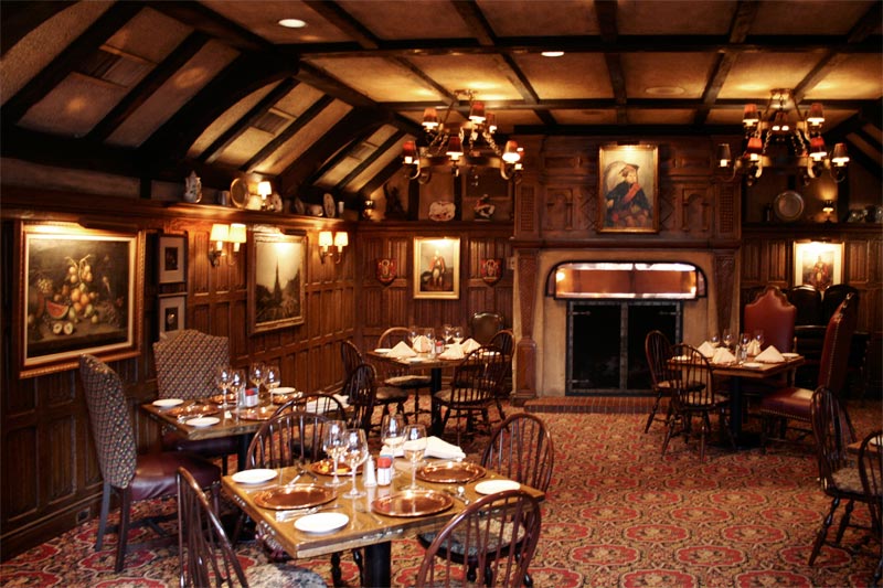
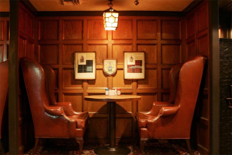
Typical exposed dark wood beams, white walls, large stuffy armchairs and heraldry crests fill the interior, giving it the proper "Old Englishness" of the British Isles.

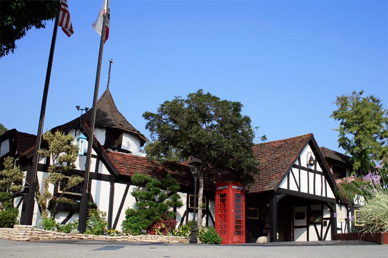
Indeed, the requisite red public telephone booth stands outside.

Yet the most fascinating feature of "The Tam" is its creator. The initial design of the then-named Montgomery's Country Inn (before Wayne McAllister's remodel and expansion) was done by Harry Oliver, a humorist, artist, and academy award nominated art director of films from the 1920s and 1930s.

That's right—a Hollywood art director. Oliver never received formal training in architecture. He began his career in 1911 as a set painter and then later as a set dresser (having never even gone to art school; Oliver was a grade school dropout). His expertise, in the words of Cecil B. DeMille biographer Robert Birchard, was "atmospheric settings and controlled environments...one of Oliver's specialties was recreating really believable exterior locations." And in this, Oliver didn't even use a formal crew, preferring instead movie studio carpenters.

Despite having no formal training, Harry Oliver is credited as one of the major practitioners of Storybook Style, a fanciful cottage design in which angles are askew and window panes crooked. Structures he designed in this vein were the original Van de Kamp Bakery windmill (which became the chain's signature landmark), as well as famous Los Angeles residences such as the Spadena 'Witch' House.

It's hard to beat this description of The Tam's storybook style from The Leisure Architecture of Wayne McAllister: "...a series of undulating, lopsided, eaveless cupolas with a gnarled walking stick rising from the center. Stone and stucco with storybook shingle interiors were dark with heavy half timbers supporting medieval iron chandeliers."

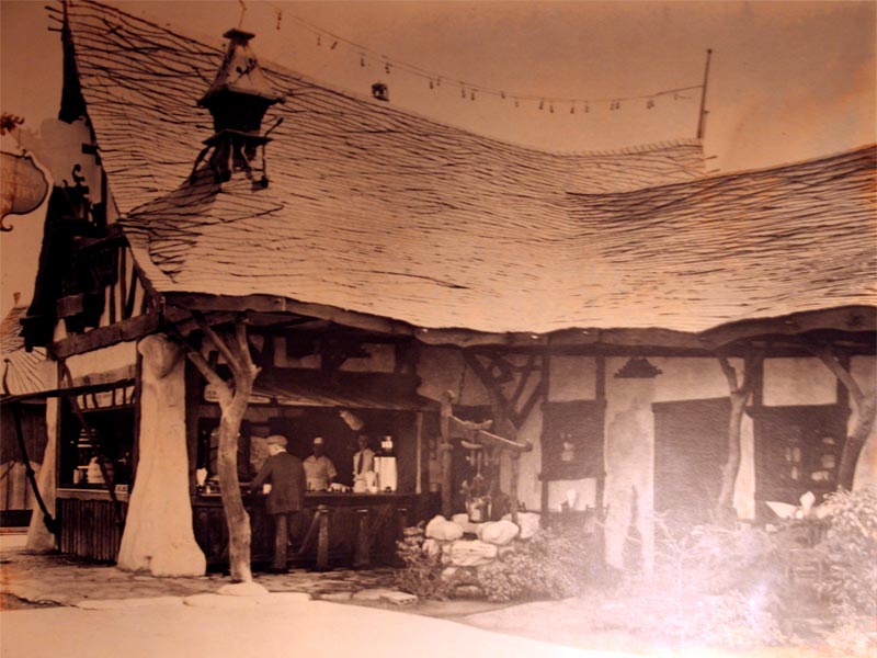
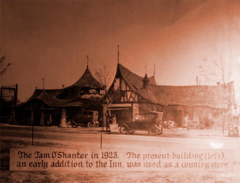
The exterior of The Tam has been remodeled many times since, but the initial design seen in this picture from the 1930s shows the fairy-tale influence; tree trunk and branch columns, topsy-turvy roof lines, knotted wood, wrought iron flourishes and homely chimneys.

The original dining room (since remodeled) was fashioned by Oliver to echo Hansel and Gretel's "witch's house."

All the wood has a wonderfully weathered feeling, almost blackened. Owner Lawrence L. Frank, who hired Harry Oliver for the job, once explained that "every piece of wood which was used in [building The Tam] was thrown into fire first with the result that we never had to paint it and it got more beautiful as the years went by."

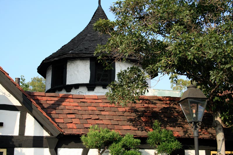
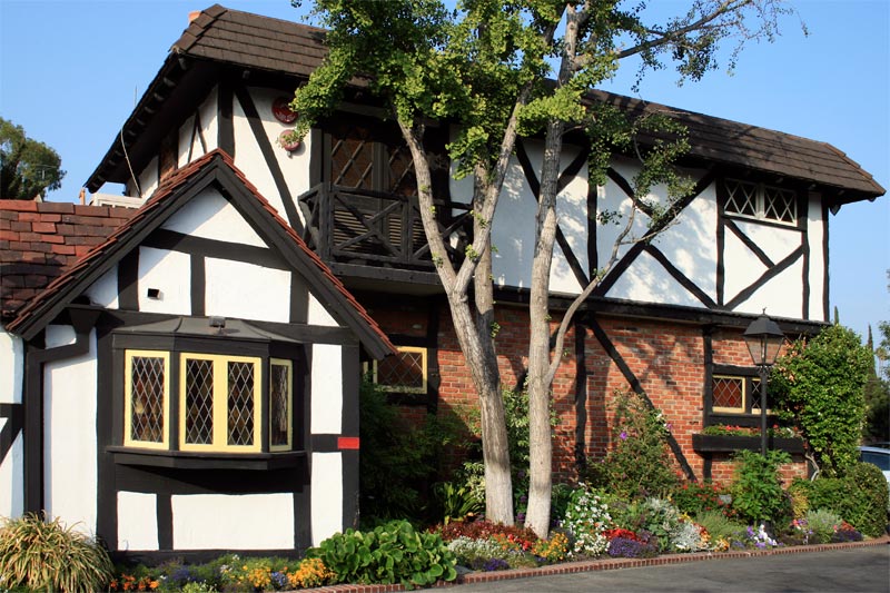
Today the overall motif would probably be associated with something like the Lord of the Rings films—a small country cottage for trolls. One of the few remaining original exterior features is the central cupola.

I can only wonder what Walt Disney thought as he dined here nearly every week during the 1930s, 40s and 50s. I'm guessing (no matter how good the food was) he found the environment positively narrative-rich. The Tam is a building straight out of the head of a motion pictures set designer, not a formally trained architect. This would be the exact approach Walt would employ when building his dream park—hiring film people like Harry Oliver.

Not limited only to fairy-tales, this early thematic designer was also fascinated by Spanish California and the Old Southwest. Oliver designed, directed and produced Gold Gulch,  a 21-acre 1850s old west mining camp replica that was the largest concession at the 1935-1936 California Pacific International Exposition in San Diego. He even consulted on Knott's Berry Farm's original Ghost Town themed area, but it's rumored that Walter Knott dismissed his designs for being to fanciful and not a serious enough re-creation.

Harry Oliver's place in the lineage of thematic design can't be understated; he essentially introduced the coming overlap between cinema and architecture. This was an informal cross-pollination in which those accustomed to conceptualizing the temporary, fantasy worlds of film sets turned their talents towards constructing permanent, real-world environments.

The Tam O'Shanter Inn must have captured Walt Disney's imagination, because it embodies all the creative principles that he codified when he hired art directors from Twentieth Century Fox like Marvin Davis and Bill Martin to make his Disneyland vision of a unified, immersive thematic environment, a reality.

As such, The Tam is a historical landmark of thematic design.

The Privatization of the Commons – Los Angeles Update 2.

Originally, the only retail districts I had planned on visiting while in Southern California were Jerde's CityWalk and The Grove, but one of my instructors at grad school alerted me to Rick Caruso's latest development, Americana at Brand. 

Located in Glendale, just north of downtown Los Angeles, Americana at Brand opened this past May to rave reviews. The development continues the Main Street U.S.A. packaged-nostalgia design embodied by The Grove before it.

Unlike The Grove, Americana at Brand does not purport to be inspired by any particular time and place, and as such it has a more genericized-retro sensibility.

Many of the Art Deco architectural flourishes are nearly identical however, such as the Barnes & Noble signage.

It all seems even more detailed than The Grove, though. Notice the delicate, stylized roofline.

Rather than a central avenue at Caruso's first nostalgic outdoor mall, Americana at Brand is a square with a semi-hub-and-spoke radial design.

Like The Grove (and Disneyland), a street trolley car navigates the loop, offering free rides (which are very popular, by the looks of the cue).

In the center of the loop is a green space, with a children's playset, plenty of grass, and a small bandstand offering free entertainment.

This is flanked by a large movie theater, just like at The Grove, on one side.

Some of the vendor buildings around this park nod to Tavern on the Green in Central Park, NYC—as well as to cities like Paris and Vienna.

The water fountains in the park perform a show choreographed to music, and are the brainchild of the ex-disney creatives at WET Design, the same firm that did the water features at the grove, as well as the famous fountains of The Bellagio in Las Vegas.

Large outdoor clocks are everywhere. This contributes to a Victorian "Town Square" feeling (people out in public needed to know the time to catch trains, etc., in an era when pocket watches were expensive).

There is a bizarre industrial tinge as well. The dominant landmark at Americana at Brand is a large, distressed and rusted iron tower, that looks very much like The Eiffel Tower towards the top.

It holds glass elevators that—in a unique feature that had many young children staring in wonderment—operate with their weights and pulleys system on the exterior of the tower, completely exposed. They are, of course, over-designed and embellished beyond their mere functionality, looking quite spectacular.

What's remarkable about Americana at Brand, however, is the philosophy. Blending the retail district model of The Grove with New Urbanism towns such as Disney's Celebration, this outdoor shopping mall is also a sprawling, high-density residential complex.

Apartments, ranging from studios to townhouses to luxury suites, sit above the ground-floor of every facade. Caruso Affiliated, after all, is a real estate development firm. Again, this is theming as lifestyle—not only are these ersatz spaces used for entertainment and amusement, they are now inhabited, permanently.

Complex property issues arise from the format. The streets and buildings are private, to be sure, but as The Los Angeles Times has reported (with regards to the pet policies; dogs must be small enough to carry), the two-acre green space park in the center of the development is, by virtue of zoning, actually public property.

This convoluted relationship is further exacerbated by the design of the complex. Americana at Brand very consciously evokes a concept as old as the first human settlements—"The Commons." Americana is channeling the design history of public spaces to appear to be public property (such as a town square, or downtown), even though it's a private mall. Los Angeles Times architecture critic Christopher Hawthorne sums this problem up nicely:

[The design of the complex] "makes the distinction between public and private in the final product almost impossible to untangle. At the Americana, the park is public space masquerading as private space that is masquerading as public. Got that?"

I was met head-on with this convoluted state of affairs when, after being on the premises for a couple of minutes, I began snapping the pictures you see here for my research. I was immediately accosted by an (albeit, friendly) rent-a-cop who informed me that all photography, other than personal shots of friends and family, is strictly prohibited. That's right—no pictures of the lovely greens, the fountain, or the fun trolley car. Of course, many folks on flickr have taken them anyways.

After discussing my intent with the polite rent-a-cop, I was informed that I could get a photography permit from the marketing director's office. Fortunately, because I'm only a graduate student conducting research (and not someone shooting for stock photo purposes, etc.), I was able to fill out the lengthy paperwork and get a laminate pass that kept Americana's private security force at bay. I was bothered enough by the incident to write a letter to The Glendale News Press.

Even Disney—the most zealously litigious of all major media corporations—encourages copious photography of every nook and cranny of their theme parks (although they ask that these images not be sold for profit), and generally allows for commercial publishing of these images with permission.

Themerica has taken me all over the world, from Dubai to Walt Disney World, from Paris to Tokyo, from Hong Kong to Macau, from Las Vegas to Southern California—and Americana at Brand is the only place I was told I was not allowed to photograph without prior written permission.

Americana at Brand is troubling for all these reasons, but overall because it represents a recent trend in "public" spaces that are actually private—this is the privatization of the commons. Spaces that are built like a town square (public), but are more like a corporate campus (private); no free speech, no photos, no rights. You can read more about this ongoing debate over Americana policies at, among other places, the Franklin Avenue blog.

I guess it's worth stating, then, that all images in this post are © Caruso Affiliated, and are posted here under fair use for educational purposes.

Theming As Lifestyle – Los Angeles Update 1.

After time spent at both the Disneyland Resort and Universal Studio Hollywood, I visited two sister complexes in the Los Angeles area that represent—like Jerde's Citywalk—yet another future trajectory for thematic design.

Both The Grove (2002) and Americana at Brand (2008) are outdoor shopping, dining and entertainment sites designed and built by real estate developer Caruso Affiliated. The firm was founded by Henry Caruso—who also started Dollar Rent A Car—and is currently headed by his son, Rick.

The official inspiration for The Grove, as reported by The Los Angeles Times and elsewhere, is the city of Charleston, South Carolina circa the 1940s. I found this surprising when I read it, because there is a palpable Southern California golden age nostalgia about the place.

However ostensibly based on a real locale in the Southeastern United States The Grove's designers claims it to be, its true lineage is really Disneyland's Main Street U.S.A.

Main Street U.S.A. is the singular entry corridor to Disneyland and a fantastical tribute to Walt's childhood town of Marceline, Missouri. Wrapped in nostalgia and Americana, it was designed to represent the coming of the automobile and electricity (circa 1890–1910). Main Street is not really Marceline at the turn of the century, of course, rather it's sort of a victorian gingerbread anytown (hence the U.S.A. name), and The Grove mimics it in both form and function.

First, the aesthetics—this is not straight simulation, but rather a vision of collective memory; a nostalgia for something that never existed. It's cleaner—no dirt, mud, horse stink (or poverty) and it's also simpler—no differing races, creeds, classes (or crime). This kind of design approach is best described as eliminating visual contradictions.

The use of forced perspective at the very tops of the building facades is slighter than at the Disney Parks, but still perceptible. Even the topmost floors of The Grove are functional, after all, and so must be reproduced at near-full size.

Art Deco flourishes—common to the general time depicted here—abound.

The orientation of the central avenue is nearly identical to that at Disneyland—complete with a trolley car that runs up and down on busy days (it was unfortunately out of service when I visited).

A central plaza and green space sports a water fountain show by WET Design (founded by ex-Disney imagineers) who created the famous fountains at the Bellagio in Las Vegas, countless water features for disney parks and attractions, as well as a similar water show at the new Americana at Brand.

Second, the utility—just as at Main Street U.S.A., lavishly adorned false-front architecture serves as facade for a large retail complex. Inside, all of the businesses at The Grove appear as regular mall outlets and, as at Disneyland, several are interconnected, despite their outer appearances being small, individual proprietorships. In the tradition of Venturi and Brown's "decorated shed;" here, then, is the "decorated mall."

When compared to Jerde's postmodern Citywalk, The Grove is a striking contrast. Instead of a departure from (and an adamant rejection of) Disney's simulation-centric nostalgic representation, The Grove embraces it.

The Grove represents the culmination of an architectural trend that has spread across the United States for several decades, reaching high zenith in the 1990s; one of very consciously manufactured nostalgia instead of overt modernism or flashy pop sensibility.

It's hard to estimate in numbers how influential the Disneyland Main Street model has been; but the influence is certainly there. In the fifty years since Disneyland opened its gates, shuttered downtown districts across the country—decimated by the suburban mall, and later, the big box—have sought to revitalize (and grow their tax base) by gentrifying their own once-bustling Main Streets and taking a page from Disney.

This has extended to the residential sphere as well. Masterplanned communities that wrap themselves not in high-tech gloss or Frank Gehry "starchitecture," but in a re-imagined, pre-war faux-yesteryear have been spreading wildly for over two decades. This neo-traditional neighborhood concept—clearly influenced by the thematic design of Disney and others—is part of the New Urbanism school of architecture that arose in the United States beginning in the 1980s. Prime examples include Seaside, Llorida (where, appropriately, the sterile reality-television town of 1998's The Truman Show was filmed), Prospect New Town, Colorado, and Disney's own Celebration, Florida (designed by Robert A. M. Stern).

The Grove is unique in that it represents the creation of a re-vitalized retro-downtown from scratch, without having actually re-vitalized anything that came before. And like its more recent Glendale sister, Americana at Brand, outdoor decorated malls such as The Grove (and New Urbanism residential developments with a shared vision) signify the growth of thematic design beyond entertainment and leisure.

Whereas before, one experienced a thematic environment for a day (Disneyland) or a series of days on vacation (Walt Disney World); now it's possible to shop, work, and even permanently reside fully encased in the visual narratives of imagined nostalgia. It's theming as lifestyle, and from the suburbs of southern california to the desert daydreams of Las Vegas and burgeoning Dubai—it's on the rise.

Referential Versus Representational – Universal Studios Hollywood Update 4.

Directly adjacent to the Universal Studios theme park is Universal Citywalk, which opened in May, 1993 (undergoing a large expansion seven years later) and does not require an admission entry.

This 23-acre shopping and dining district was designed by the legendary entertainment architecture firm Jerde Partnership International, noted for other such spaces; Horton Plaza (San Diego; 1985), Fashion Island (newport beach; 1989), and the Mall of America (Bloomington, Minnesota; 1992). In Las Vegas, the Jerde firm has developed numerous thematic environments; Treasure Island's pirate show and facade (1993), the Fremont Street Experience (1995), and the entire Bellagio resort complex (1998). The Citywalk project also has lead to collaboration with Universal at both their parks in Florida and Japan.

The work of Jerde, Universal Citywalk in particular, represents one of the vectors that thematic design has been traveling—away from its Disneyland roots. In an earlier post, I elaborated on a gradient that tends to form between two extremes: Pure Simulation and Pure Brand. Near one end, there is Main Street U.S.A., for example—a conscious attempt to recreate Americana at the turn of the century. Near the other, there is something like Niketown—a space where the only representation is the brand itself.

Universal Citywalk falls somewhere in the middle. It's not simulation, and it's not brand—it's sort of referential. Instead of trying to represent various icons of Los Angeles architecture and design, the space creates a new environment for these icons in which they are reassembled and then referred to. Not replicated, not simulated, but nodded to.

Visceral Reality, a 1998 monograph of the Jerde Partnership International, notes that the firm consciously avoided the simulation end of the spectrum. Jerde "did not want [Citywalk] to be an imitation of any other place or time period."

The passage continues; "The [Citywalk] design, thus, became a collage of the images and characteristics of the city of Los Angeles; it distills the atmosphere, the ephemeral quality, of Los Angeles street life, without duplicating any of its iconic architecture" (emphasis is mine).

There is a level of distance (not cold, but sort of a playful detachment) between the source and the execution. That distance grows greater the closer you get to Pure Brand. The path from one extreme to the other, then, would look something like this:

  • PURE SIMULATION (Traditional theming)
  • REPRESENTATIONAL (Interpretive theming)
  • REFERENTIAL (Decontextualized theming)
  • PURE BRAND (Self-Reflexive theming)

If New York, New York in Las Vegas looked like a giant Lego Store display, Universal Citywalk is a smattering of oversized garage sale purchases lined in a row, baking in the Southern California sun.

Lawn gnomes, Mother Virgin Mary charms, and vintage furniture pieces aplenty. Here, kitsch is cool.

Jerde encouraged individual retailers (attached to long-term renter contracts) to develop permanent spacial designs and signage to reflect the uniqueness of their brands.

The intriguing and engaging design of these retail spaces has endured longer than some of the businesses. One former tenant, Sam Goody music, closed its Citywalk location following a massive bloodletting in 2006. The storefront tower, reminiscent of the Capitol Records tower in nearby Hollywood, remains.

There is loud, roadside neon throughout, with a healthy dose of Route 66-styled retro thrown in.

Some are functional; others are antique examples installed purely for atmosphere.

Universal's own King Kong is thrown into the mix, in the style of a roadside advertisement.

Even the most recognizable national brands have created unique inflated, pop architectural details for their Citywalk outlets. Here, every store is a "superstore."

Exaggeration and giantism are the name of the game (literally).

Many architectural features typical of the region are sprinkled into the medley. The lighting seems to have been plucked from the area's tangled freeway network—nearly identical to Los Angeles county municipal streetlights.

The drive-in, long time mecca of Los Angelinos, is here too—at least in vague tribute.

It's disemboweled, appropriately shown to be past it's prime. Again, it's not a simulation or a representation—I don't feel that I'm really on a drive-in lot. There's a distance between me and the reference being made, but I still get the message and know where it's coming from. It's just less immediately felt.

I am left with the icon of the drive-in's bulky frame, without enough environmental context to fool me into thinking that I'm actually there.

The same goes for these large billboard-styled signs atop the perimeter. Since there is no context, I can't really feel that I'm out on the expressway, or in the middle of a city.

Fortunately, there's a healthy sense of humor here.

Where else would a UFO crash into a comic book store?

You Are Here, the Jerde firm's 1999 monograph, describes these various elements. "Citywalk is both unique and familiar—a collage of the images and characteristics of vernacular Los Angeles architecture. The project's buildings are formulated from a 'kit of parts' of generic components: decorative tower and marquee elements, flat simple facades with a layering of various grids and signage."

Within this "kit of parts," however, there are many self-contained thematic venues within the Citywalk itself, just like I've seen inside both Mandalay Bay, Las Vegas and The Venetian Macau.

Well known theme restaurant chains, such as the Bubba Gump Shrimp Co., dominate Citywalk.

The initial Bubba Gump's location opened in 1996 in Monterey, California—the first such chain to be based directly on a film property (1994's Forrest Gump)—and there are now nearly 30 scattered throughout the U.S., Mexico, and Asia.

The front facade of the Citywalk location is a good example of referential, versus representational, design. Note that the masts of Gump's boat from the film (the Jenny) are not sitting atop an actual replica.

There is no water, no dock, no seaside setting. Just concrete. The masts are instead decontextualized; taken away from both ocean and boat.

If Disney's imagineers had designed this restaurant, there would likely have been an actual environment surrounding it to provide context, because Disney tend to practice more traditional, simulation-based theming. Such a thematic environment—with a recreated dock, water features and seaside landscaping—would have clashed with the look and feel of Citywalk's referential collage. Jerde's aim is to remove sources from their original context and collage (reassemble) them into a wholly new setting.

Once I moved inside, however, I found the restaurant employed more traditional, representation-style context. This was closer to simulation; a series of beach shacks on the bayou. There was now environment—there was context.

Deep inside the restaurant, I was far enough from Jerde's montage of "kit parts"; the more traditional theming here enveloped me without clashing with the overall thrust of Citywalk's exterior.

At night, the Citywalk creates the same kind of visceral, dynamic energy as the Las Vegas Strip, replete with garish (yet well-designed and attractive) signage and lighting.

Although a decontextualized montage that departs from traditional theming, the space has continuity, similar to the cinematic staging of parks like Disneyland. In the words of Jon Jerde, "when I look for urban archetypes, they are not things, they are sequences."

Universal Citywalk is a fascinating example of the referential; decontextualized thematic design that moves further away from Pure Simulation and towards, but not quite arriving at, Pure Brand.

Sacrificing the immersion of simulation, the space instead excites through its multiple, fragmented references.

At first I thought this would be jarring (as Universal Studio's numerous incongruities were), but rather, since Jerde establishes this as the program from the outset—here is a montage, it's not meant to simulate, replicate or otherwise re-create—he succeeds.

It's not theming in the traditional sense, but it's the direction that much retail and restaurant design has gone in the past two decades (due in no small measure to Jerde himself).

And let's not forget the nice pun on the way to the parking lot!

Postmodern Pleasure Palace – Universal Studios Hollywood Update 3.

The second attraction at Universal Studios that I enjoyed was the brand new, $40 million Simpsons Ride, which replaced the Back to the Future Ride before it. The technology is derivative of Disney's aforementioned Star Tours, but instead of individual simulators, all vehicles face a single, massive IMAX-style screen (the Star Trek Experience in Las Vegas uses the same approach).

The Simpsons Ride, like the show, is distinctly postmodern. Here, the emperor (or "The Wizard," rather) has no clothes, and everybody knows it. As such, the attraction openly mocks the theme park concept—Krustyland, "The Krusty-est Place on Earth"—it's proprietor (Krusty the Clown), the audience, and the ride itself.

For someone like me who has spent a good part of the last year trying to take these places as seriously as possible, this was some very welcome comic relief.

This is hardly just a gloss-over parody, however. Great attention was paid to the smallest details and inside jokes, some of which only make sense to long-time Disney park fans.For example, the entryway to the attraction is flanked by a large, poster-sized park map of the Krustyland park—drawn at the same level of execution as the infamous Disneyland poster maps.

The references are delightfully blatant to even the most casual theme park visitor. This smacks of Disney's Big Thunder Mountain railroad attraction.

And the classic Jungle Cruise (this time with a killer octopus).

There are small in-jokes for those that watch the show, too.

The front area of the park resembles Disney's Main Street U.S.A. There is so much detail to take in on this map that you can spend most of your time in the queue just admiring it.

Besides Disney, there are countless other reference to either amusement park mainstays, or local Southern California favorites. Here on the left is a log flume that is styled very much after the original at Knott's Berry Farm.

And an killer whale show theater nearly identical to those seen at Sea World in San Diego. The town of Springfield is visible in the background.

The signature puns that have made The Simpsons so popular abound.

Every attraction name is loaded with references.

Many of Krustyland's imaginary attractions are conscious rip-offs of Disney classics, such as Pirates of the Caribbean and The Haunted Mansion. These are given their own framed posters, just like at Disneyland.

Are these jabs a none-to-subtle reference to Universal and Disney pillaging each other's techniques and concepts over the years?

Just like Jurassic Park: The Ride, the ride is themed to actually be a ride—Krusty's Carnival Midway.

Fittingly, the exterior show building sports Coney Island-eque boardwalk styling.

The attraction also employs the "wrong turn" narrative trick of the Jurassic Park ride. Here, though it is no accident, but the malicious melding of a long-standing antagonist of the series "Sideshow Bob." As a result, we are thrown on a crazed chase through Krustyland, breaking into most of the parody attractions that we saw on the poster map in the entry cue.

All in all, the experience was fantastic—I had to ride it twice.

But what makes the theming of The Simpsons Ride unique is this self-consciousness that can only be called postmodern. What is the simulation here?  On one level, we're entering the world of The Simpsons; this is Springfield, and I am now yellow. On another level, we're entering the world of Krustyland, which is itself based on other such fantasy places such as Disneyland. So the theme is Springfield, and the theme is also a theme park, within Springfield.

Physical structures that once only existed in the Simpsons cartoon universe are replicated outside the attraction area with astounding precision, such as the Kwik-E-Mart (itself a parody of the ubiquitous 7-11 chain).

The smallest details, down to the pay phones, were not overlooked.

The exterior walls of Moe's Tavern look just as they do in the animated realm. Is this a simulation, a representation, a reference, or just pure brand?

This brings up something interesting from the blog comments about War Game at Fisherman's wharf in macau. A sharp reader pointed out that this attraction was based on a video game—so in addition to representing a geographic locale, the theme is also the gaming environment itself; a virtual world. How do you characterize such a space, with multiple (and sometimes contradictory) reference points?

The Simpsons Ride is somewhat similar, referencing Disney, theme parks, and its namesake television series—not to mention all the smaller cultural nods that make up that universe, which themselves come from all over the place.

As gestalt, however, it totally works; a postmodern pleasure palace.

It's Right When Things Go Wrong – Universal Studios Hollywood Update 2.

Universal Studios Hollywood may have been disappointing overall, but there were two attractions that were rather clever, and deserve a bit of analysis. The first of these is Jurassic Park: The Ride. When it opened in the summer of 1996 (although it had been in development foo two years prior—during the original film's production), this water-flume attraction was the park's number one attraction. Over ten years later, it still commands some of the longest wait times.

Designed to complete with Disneyland's Splash Mountain (the leading flume-drop attraction in the area), the detailing of the entire Jurassic Park area—including the eponymous torch-lit wooden gate—is very well done. They've invested in subtlety and scaling that pays off. This is one of the few areas at Universal Studios where I felt enveloped in and engaged by the environment.

This whole part of the park is surrounded with dense tropical palms, which collectively function as a mini-berm to isolate the attraction from its neighbors.

It's really the only part of Universal Studios that even seems like a theme park—good thing that's the actual premise. Following the story of the film franchise, we are on that famous Costa Rican island where dinosaurs have been bred and put on zoological display for tourists to ride one of the park's signature attractions, a boat cruise.

The queue area thus requires no additional theming. The attraction is meant to look like, well, an attraction. This effect is completely with the requisite safety videos (containing some subtle wit and inside jokes).

Once on board, an automated narration (the same from the film) directs our attention to various dinosaurs on display. So far, so good. What's most clever about the attraction, however, is the story twist. About half way through the ride, our boat literally takes a wrong turn and enters a secure area. We then discover that (surprise!) many of the dinosaurs have gotten loose and now we're in really trouble. I apologize for not having more detailed pictures—the ride was too wet to bring my digital SLR camera along.

The theming of the final flume drop is well executed. Our boat has entered a massive water treatment facility, and we end up being flushed down the drain, so to speak. When we return to the loading dock, it's back to the original narrative of a theme park attraction, and apologies are made for the "malfunction."

This is a story approach that Disney actually pioneered with it's successful Star Tours attraction in 1987—when things go wrong. Based on the Star Wars film franchise, guests of Star Tours are space tourists on a commercial shuttle flight. Thinking that we're going on vacation, we are instead dropped into the middle of the conflict between the Empire and the Rebellion (complete with a Death Star) by an inexperienced robot pilot.

The "wrong turn" occurs right near the beginning, and immediately the audience knows that they're in for something different. For many years, everything went perfectly right at Disneyland (that's the idea). Then a younger generation of thrill-seekers, accustomed to the "safe" fantasies of the park, came of age and yearned for something extra. Star Tours provides that. By breaking the attraction (but keeping the illusion intact), Disney was able to create an added dimension of surprise. A fantasy within a fantasy, in which the original (perhaps more tame) fantasy is unfulfilled in favor of the "accidental" fantasy (which turns out to be quite thrilling).

Others have copied this approach since, such as the Star Trek Experience at the Las Vegas Hilton. The premise is extremely similar to Star Tours, yet it takes things even further. The fact that you're about the ride a simulator is overt, just before you are beamed to the future for the "accident" fantasy. By the end of the attraction, Captain Picard announces that you've returned to "your own time," to the "simulators you were supposed to ride." Again, it's the "wrong turn" approach, taken to the next level.

Jurassic Park: The Ride goes even further than either Star Tours or the Star Trek experience by theming the environment as a theme park itself (the original premise of the source film). The attraction that you ride is actually a simulation of a ride—the ride that is going to "malfunction," and provide the fantasy within the fantasy. It makes perfect sense, for the dinosaurs to present any danger, you first have to let them out of their cage to "break" the ride.

All which made for a thrilling (and complex) thematic immersion; one of the few at the otherwise lackluster Universal Studios.

Lights, Camera, Inaction – Universal Studios Hollywood Update 1.

Universal Studios, near Hollywood, is one of the LA area's oldest amusements. Yet what began as a simple backlot tour during the silent film era took many years to evolve into something of a theme park. Probably due to the immediate success of nearby Disneyland, in 1964 the modest tour was expanded to take guests even further backstage.

Into the seventies, the studio slowly began experimenting with adding more ride-based attractions and live entertainment. By the 1980s and 90s, this trend had accelerated with popular rides based on film properties like E.T., Back to the Future, Conan the Barbarian, The Mummy and The Terminator.

Universal subsequently spun off its franchise into parks in Orlando, Florida (near Walt Disney World) and Osaka, Japan. Recently the company broke ground on its new park at the Dubailand site, expanding into the Middle East.

Universal has a curious history with the Disney organization. The two have (no pun intended) often played cat and mouse in the themed entertainment market. The announcement of coming to Florida spurred the company to rush its competing Disney/MGM Studios (now Disney's Hollywood Studios) to completion in 1989, beating Universal to the punch by nearly a year.

Disney had directly lifted the "studio backlot tour" and themes of golden age Hollywood, and Universal was not amused. To add insult to injury, the company didn't stop there—there are now very similar park formats at both the Disneyland Paris Resort (Walt Disney Studios) and the Disneyland Resort in California (as a land in Disney California Adventure).

Universal has sometimes responded by riding the coattails of Disney's more popular attractions, coming up with cheaper imitations to compete. For example, the former Back to the Future ride (and current Simpsons ride) use the same motion simulator technology as Star Tours, and the Jurassic Park ride was the studio's answer to the massive flume drop of Splash Mountain. The organizations have also shared common talent. Many former Disney creatives and contractors have gone on to work for Universal, most notably on their Japan project.

You would think that given it's long history (and this competitive banter with its rivals), Universal would have a tried and true format. But the park is beginning to show serious age, and as an example of thematic design, it's a total mess.

There are random groupings of themed sets, some fairly well designed, from the Old West...

to New York City.

From the streets of Paris...

to London.

A Mexican cantina appears out of nowhere, for example. Part of this is because Universal never set out to design and theme park (like they did in Orlando and Osaka, which are by many reports more cohesive), rather attractions (or "rides" as they plainly call them) were added piecemeal over the years, giving the park a Frankenstein-like multiple personality disorder.

Part of this is also the location, which is far from ideal. The first chunk of the park sits upon a bluff, overlooking a valley far below where the actual studio lot sits. All visitors must descend and ascend through a series of long escalators down a cliff wall to the rest of the attractions on the lower level.

It feels like being in a airport, and although the smoggy view of the San Fernando Valley is sort of charming, a barrier to the outside world is required to maintain thematic illusions, and here we have none. Plus, other movie studios, such as Warner Brothers, are in plain view—ruining the exclusivity of universal's offerings.

One of the key lessons of Walt's original Disneyland formula was control; control over access to the outside world (via the raise berm around the park), control of movement between one theme to another (within an illusion of choice at the plaza hub), control of entry and exit (the main street corridor, at the front). These restrictions actually provide freedom to guests—freedom to enjoy the fantasy, become immersed in the environment, and fully live the themes with which they are presented.

With no berm, no clear navigation center, and the disconnect between the bluff above and the valley below, I actually felt more disorientated (and confined) than I've ever felt felt under the tight grip of Disneyland. Because it's a warm grip, a helping hand; it allows one to forget the cares of everyday.

Universal studios felt loud, garish, crowded and hot by comparison. It wasn't any busier than Disneyland, where I had spent the last few days, and the weather was the same, but every negative felt amplified by the lack of cohesion around me.

Transition zones were presented half-heartedly or completely non-existent. The sci-fi future world of The Terminator sits adjacent to merry Olde England. The island tropics of Jurassic Park are across from the ancient Egyptian temples of The Mummy. The 1950s are next to The Flintstones. And all of it surrounded by the numerous regular warehouse structures of a working studio lot.

The incongruous diversity of the Las Vegas Strip succeeds by comparison because it doesn't present itself as a single, consolidated entity—it is, very clearly, indeed just a "strip" on which various proprietors have set up shop. The Strip is an open-air market, so to speak, so I expect a bit of jarring disconnects, a bit of noise, and a whole lot of visual inconsistency.

Universal, by virtue of a single gate and a single admission, tries to pretend that it is a single entity, parroting Disneyland's park concept. But because it's such a hodgepodge, it falls flat. Spread out along a single boulevard, with no fence around it; then Universal Studios might work.

it's not only the geography that works against the theming of the park, however; it's also how the subject matter is treated. Hollywood movies are about fantasy and illusion, fair enough. Universal Studios derives its narrative power from taking you "behind the scenes" to see how these illusions are actually made.

In essence, the wizard himself is selling tickets to have us pull his curtain away. And then, in trying to use thematic design to tell this story, he admonishes us to "pay no attention to the man behind the curtain" but it's far too late. You can't construct a simulation in order to show that's it's all a simulation. The thought alone makes my head hurt in all new ways.

The techniques of geographic compression and forced perspective are used throughout, but the effect feels hollow.

They're not just cleverly designed like movie sets, they actually are sets.

Disney, conversely, embraces the illusion. For example, the official company policy is that Mickey and his friends actually live in the park. There are no behind the scenes, behind the scenes. The fantasy is real, presented as real, assumed as real, and consciously designed to be perceived as real. No confusion here—what you see is what you get.

For all these reasons, Universal Studios Hollywood may be decent entertainment, but it's very poor thematic design.

I Heart NY(NY) – Las Vegas Update 7.

One design setting that is more unusual to find is pure urbanism—that is, the theme is "city" itself. Sociologist Mark Gottdiener counts this among the numerous thematic archetypes in his key work, The Theming of America. He was also keen to note that this theme does not recur with the same frequency of mainstays like Tropical Paradise or the Wild West.

The New York, New York Casino Hotel (NY, NY) is certainly not the only resort on the strip to represent such a specified setting of place. Both The Venetian and Paris that I discussed earlier embody the look and feel of their respective cities—but NY, NY is the only one to stress this overarching sense of urbanism.

In this sense, the resort not only simulates the look and feel of New York City, but environmental details common to all large cities—much like a tropical paradise setting represents all beaches and jungles, even if the theme is further localized to say, the South Seas. Accordingly, the resort's tongue-in-cheek motto is "The greatest city in Las Vegas."

In contrast with the awe and grandeur of Venice or the quaint provincialism of Paris, walking around NY, NY I felt the sometimes unnerving but always lively bustle of life in the big city.

Because I live in downtown San Francisco, one of the largest (and loudest) cities in the country, some of the subtleties of the overall presentation were lost on me. I frequently found myself focusing only on the drawbacks and flaws in the design—in the same way, I suppose, that a resident of Venice would find The Venetian (not only patently fake but somewhat ridiculous).

I've only seen New York City through the eyes of a west-coast tourist, so my own level of scrutiny was far less than a local's might be of this simulated Manhattan. Still, as a city-dweller, I was not very impressed (in the sense of wonderment). There is no fantasy here for me. I fight the crowds, the lights, the noise, the smells of urbanity on a daily basis. NY, NY was about as exotic for me as a trip to the local convenience store, or to my favorite neighborhood watering hole.

Still, much about the design is noteworthy. The exterior of NY, NY is a perfect architectural collage of the city's most well-known and best-loved landmarks.

Unlike Paris or The Venetian, this forced-perspective skyline literally gives rise to the numerous hotel room towers. As a guest, you might stay in the Chrysler Building, for example.

Fortunately, the World Trade Center was exempted from this montage, perhaps owing to their modernist simplicity (all the other major structures chosen are delightfully Art Deco). No need to consider a troubling remodel after 9/11. Both reality and the Vegas representation are now consistent.

On the southwest corner of Las Vegas Boulevard and Tropicana Avenue, a miniature Statue of Liberty stands tall.

Below her, there is a "harbor" complete with water fountains fashioned from NYFD tugboats. Around this area there is also a series a placards which commemorate the victims of the WTC attack.

There is less staging area out in front and around the perimeter of the casino property than resorts like The Venetian or Bellagio. The one exception is a massive, downscaled and compressed span of the Brooklyn Bridge. This prop simulates the real-life walking path of proper wooden planks, and runs parallel to the strip. Unfortunately this area is comparatively shallow and does not recede very far from the street.

Behind this bridge, below the upper skyline hotel towers, sits a more street-level simulation of a vaguely New York-ish neighborhood, complete with the appropriate advertisements and a Broadway-esque theater marquee.

Here is all of downtown New York in one single breath, much the way that Paris combines multiple icons into a singular essence. Yet here, the combined effect is that of a booster postcard. Almost a cartoonish caricature of exaggeration. At Paris, the landmarks are indeed scaled-down, but this is done with particular care, almost a stoicism (it feels even more so that way at The Venetian).

The exterior of NY, NY almost looks as if it was assembled in a toy store, like one of those giant Lego displays of the U.S. Capitol or Mount Rushmore. It's more cute than anything else, and that's probably why the hotel casino draws more of a down-market (though still middle-class) crowd.

Inside, the casino floor and all adjunct areas have a nighttime indoor-as-outdoor effect. This works surprisingly well; it just feels more like a city at night, strange as that sounds. Many of the gaming areas contain Manhattan landmarks. You can play blackjack outside Central Park's Tavern on the Green, for example.

Unlike Paris however, the stage lighting is visible from the black ceilings, and large murals give a sense of depth (but in a movie-set, rather than realistic, fashion).

The main lobby and elevator banks for the various hotel room towers break from this and adhere to a formal 1930s Art Deco style found in many of Manhattan's most famous buildings.

This is accompanied by some stunning atmospheric mural work, again in a 1930s style.

It was particularly enjoyable to sit for a few hours in the "Greenwich Village" section, which is the retail and dining district adjacent to the main casino floor, and listen to the comments of some New Yorkers visiting Vegas on holiday. They ranged from incredulity ("This is [expletive deleted] weird.") to amazement ("I can't believe they actually did [insert particular replica or special effect here].")

In particular, one guy (who sounded like he was from Queens or The Bronx) marveled at a detail that had escaped me initially; the forced-perspective tenements even had appropriately-scaled air conditioners hanging out of the windows.

Although the urban setting was not particularly exotic for me, I did appreciate many of these other small touches—the designers here have done their Disney homework. Parking meters, mailboxes, trash bins and street signs were all suitably authentic.

Prop Vignettes abound, such as this neighborhood hardware store display.

My favorite flourish was the ADT security sticker (a real company) found in several of the street-level apartment windows. Even crime is crucial to properly representing the urban theme in totality.

And let's not forget a healthy does of filth and decay. Great effort was made to distress, mar and otherwise "trash-down" the city to make it believable. A crisp, clean, new New York would be laughed at instantly. This tenement is nice and shabby.

I had read that in the early years, the NY, NY branded manhole covers on the streets actually steamed, but I talked to some employees in the area, and apparently the effect hasn't worked (or been turned on) in some time.

Even for those who have never visited New York, it lives in the American imagination through its continual portrayal in film and television. Curiously, the city's actual streets are far cleaner, and much safer, than they were even fifteen years ago (and light years ahead of the nearly broke murder capital that NYC was in the 1970s).

Yet the thematic representation here in Las Vegas is modeled after those old stereotypes, perpetuated through gangster and action movies. It might be more pop than the real Manhattan, but it's also a shade darker.

Upstairs is an amusement area that pays tribute to the historic attractions of Coney Island in its heyday, complete with a video arcade.

The signature attraction, however, is a large, steel roller coaster—themed like the city's infamous classic Checker Cabs—that winds its way atop the outside of the resort for a fantastic view of the strip, day or night.

NY, NY demonstrates a few things about urbanism as a thematic archetype. Firstly, the appeal of the theme is limited to those who aren't city dwellers. This works in Las Vegas, where scores of visitors flock from the desert, the mountains, and the plains. To someone coming from Los Angeles or Chicago, however, it's considerably less exotic. No big deal, though. The diversity of the strip negates this shortcoming—Arthurian England and Ancient Eygpt are just a bit further down the block.

Secondly, the urban theme draws just as much upon the popular and media conception of a particular time and place as reality. Cities may be dirty, crowded and noisy—but it's more exotic and engaging to play up the dissonance and danger, and thus the drama. New York might seem like a rough (yet exciting) place for someone who's spent their entire life in Nebraska to visit, and a thematic environment representing this fantasy must capitalize on urban stereotypes to deliver the anticipated impression.

An American in Paris (Nevada) – Las Vegas Update 6.

After spending countless hours combing every inch of Las Vegas, I can say that Paris is probably my favorite of the major themed casino hotels on The Strip.

Some may argue that The Venetian is just as elaborate, or just as classy, or just as lavishly detailed. To this I say, fine, "I'll always have Paris."

Granted, Paris and its Italian cousin down the street do share many design techniques. They both sport the painted sky, the indoor-as-outdoor setting, the replication of internationally famous icons, and a striking attention to architectural and typographic detail which have made the two resorts very popular with the public.

Yet Paris exudes a particular quality that The Venetian lacks—a sense of domesticity, a feeling of the familiar, and a charm best be described as quaintness—in details as small as this window box full of flowers.

Designed by world-renowned hospitality and leisure architecture firm Wimberly, Allison, Tong and Goo (WATG), The Venetian reaches out to her audience with majesty and provokes, above all, awe. The towering monuments of St. Mark's Square, the Rialto Bridge, the Grand Canal (complete with singing gondoliers); all these contribute to a feeling of "other" ("Ah, Europe") and simultaneously, intrigue ("How did they do that?").

It's the same overall impression I had of The Venetian Macau, although it seems magnified here. A friend commented that the diversity of attractions on the Las Vegas strip contributes to a sense of wonder and discovery. In Macau on The Cotai Strip there was no competing thematic design surrounding the resort, and thus no diversity.

The interiors are so richly laid with gold leaf, the replicas of art so breathtakingly beautiful, that it is hard to connect in any meaningful sense with The Venetian. Instead I'm in a mode of reverence. This worshipful awe is very similar to that felt when viewing Italy's actual cultural masterpieces, such as the Sistine Chapel.

Here in Las Vegas, however, the wonder and spectacle are inexorably linked to the exactness of the copy ("It looks so real!"), rather than the uniqueness of the original.

Paris evokes the same reaction to its exterior. The replicas of the Eiffel Tower and the Arc de Triomphe are of similar scale and detail. Yet the interior of Paris is markedly different.

Instead of the riches of empire and the grand artistic tradition of the Italian Renaissance, I felt the relative smallness of Europe, the traditional way of life, the emphasis on food, on family, and on the simple pleasures.

This is wholly different Europe. Instead of awe and wonder, it's nostalgia I felt most urgently. Strolling through the dining and shopping district (which, like The Venetian, has painted skies and the indoor-as-outdoor effect), I couldn't help but long for a more provincial existence.

This nostalgia was more comforting—and comfortable—than anything that the majesty of The Venetian (or Bellagio, for that matter) could offer me.

For example, the food court/buffet area is designed as a village courtyard, surrounded by small local businesses and houses.

The wall murals nearby contribute to this picturesque rural setting.

Wayfinding throughout the resort is as you would find in a small French village, with cute individual markers instead of consolidated, modern hotel-style signage.

Most typography is hand-lettered—suggesting older, individual, small proprietors.

Nearly all the buildings have flats and apartments above the retail floor. The resort design exudes the residential—Paris feels lived in.

Conversely, the spaces designed to appear residential at The Venetian still feel regal, owing to the sense of power and majesty that renaissance architecture connotes.

The residential feeling at Paris extends onto the main casino floor, which—unlike The Venetian—utilizes the faux-sky design from the shopping and dining district throughout, with no break in the indoor-as-outdoor illusion.

Instead of alternating to a traditional ceiling in certain areas, roof arches link one large area to the next, providing a seamless alternative to traditional pedestrian doorways. The sky can thus continue all throughout the interior of the resort.

Emphasizing this and linking the interior spaces with the monumental exterior, the massive feet of an Eiffel Tower replica atop the casino descend through the ceiling and onto the floor.

Additional free-standing support columns for the casino's ceiling are designed to seamlessly match the tower's feet, even though they are clearly not part of the structure.

Paris also places considerable emphasis on landscaping and foliage—something that The Venetian, even throughout its Grand Canal Shoppes, is completely devoid of. Notice how the green tree (this particular one is real—iIsaw a gardener trimming it in the early morning) adds verisimilitude to the scene and even makes the painted sky above it seem more natural.

I think the lack of (even fake) plant life contributes greatly to the Grand Canal's sense of claustrophobia—which was even more urgent at the sister resort in Macau.

The only time at Paris that this pleasant rural setting is broken is in the main hotel lobby. This massive hall has all the regal glory of Versailles. Yet contextually, this is appropriate—it is where official business is conducted, and guests are made to feel pampered and welcome (like royalty). Because it's the only staging of opulence in an otherwise very down-to-earth small village-like atmosphere, the lobby doesn't overpower. At The Venetian, this wealth and grandeur is all you see, and it sort of washed over me as result.

I think the Paris resort is a more effective thematic environment than the cold, distant Venetian because it draws you away from awe and brings you closer to emotions you wouldn't normally associate with the glitz and glamor of Las Vegas—family, simple times, a quiet life, the country, food and wine. for me, this personally was a welcome respite from the bustle of the strip.

Yet I suspect that it also lulls visitors into that softer place which—like well-designed malls and parks like Disneyland—allows them to part with more money than they had perhaps planned.

Conversely, the overt displays of wealth and power throughout The Venetian are somewhat imposing (not quite as intimidating as the towering, modernist Wynn, perhaps) and distancing. I felt less engaged and consequently, less inclined to spend. It certainly doesn't look like they need the money.

I think this imposition works perhaps only when viewing the original masterpieces in Italy; after all, it was reverence that the Medici Family was hoping for in commissioning so many key works during the renaissance. The awe is directed towards the artist and his paymaster.

Here in Las Vegas, one marvels at the exactitude of the replication, the detail of the deception, the cleverness of the con. And behind it all, a casino. Games of chance, hopes of the big win, so much more fallacy and put-on. In a quote attributed to Nixon, "It's the lie that gets you."

Zoos As Immersion. Theming As Education. – Las Vegas Update 5.

Mandalay Bay has one the most exciting non-gambling attractions on the Las Vegas Strip—the Shark Reef Aquarium. Developed in consultation with Canada's leading Vancouver Aquarium, this 95,000 square foot facility's main tank holds 1.3 million gallons—the third largest in North America (and the only one not located anywhere near an ocean).

As far as zoological environments go, the shark reef is heavily themed.

Playing off the generic exoticism of Mandalay Bay, you ascend (then descend) into a series of ancient temple ruins.

These ruins not only pervade the visitor spaces, but the animal enclosures as well. Fish swim (and reptiles crawl) through sunken steps and fallen statues.

All this reminded me very much of Disney's Animal Kingdom in Florida, which is easily the most lavishly designed zoological park in the world. ancient-styled carvings add to the mystery and adventure of the venue. The sense of "other" is greatly enchanted; we may not know where we are, exactly, but it is far from present-day civilization (and certainly the Las Vegas strip).

Interestingly, even though the roof of the structure is a glass conservatory-style dome, the designers painted a fake clouded sky on the walls leading up to it, above the walls of the temple ruins. I found this to be a jarring distraction; better to embrace the theme within the exhibit, and let the glass atop be a natural barrier containing the overall design. But as I've already mentioned, Vegas is a bit weak when it comes to successful transition zones.

Once you leave the temple ruins, you descend into a breathtaking plexiglass tunnel in which sharks are swimming right above your head. This in and of itself is not new. Several zoos and aquariums around the world employ the same device, such as Sea world in San Diego, California.

The difference is that this tunnel then leads you into the central thematic space of the shark reef—a sunken shipwreck (presumably from the era of pirates and buccaneers).

The experience is a holistic and immersive one—seats are offered in the form of cargo crates, and the lighting is dimly provided by lanterns.

Even the creaks and groans of the ship are heard through a surround-sound speaker system from time to time. Fortunately, the loop pauses long enough for you to forget about the effect, so the next time you hear the ship move it is a pleasant surprise.

The multiple viewing areas for the sharks and other sea life are designed as broken "holes" in the planking of the ship. In addition you can view the animals both below and above the ship enclosure.

The exit back to Mandalay Bay is through a similar tunnel to the one you entered via the temple ruins, and then you climb stairs to the gift shop, also themed as a temple.

I was musing all the while at the shark reef about the power of thematic design to provide an engaging educational experience for younger children. Nearly all the kids I observed were completely fascinated by not only the animals they were watching, but the environment in which they were in.

The temple ruins and the shipwreck not only provided staged settings for the viewing of wild life, but a context as well—adventure and exploration.

For a seven-year-old, going to an ordinary zoo can seem like a chore. The animals might be fun to look at, but the design of a zoo itself (San Diego being a delightful exception) usually isn't.

At Mandalay Bay's shark reef, the context created by the thematic design makes the entire experience a journey of discovery. First, as an adventurer, he climbs and crawls through jungle ruins.

Then, as an explorer, she finds a sunken ship deep beneath the surface of the ocean. In this way, theming is actively engaging the child, and making play out of an educational experience.

Obviously there are cases where theming has contributed to the proliferation of stereotypes, and the obfuscation of understanding. Yet at Mandalay Bay's shark reef, I suspect theming has made a positive impact. Theming is often underutilized in educational venues, such as museums. This is a shame, because immersive environments can provide context and engage children on multiple levels, making for memorable learning experiences.

The Hues of Blues – Las Vegas Update 4.

The second venue I found interesting inside Mandalay Bay, Las Vegas was their House of Blues location. House of Blues (HOB) is a nationwide chain, launched in 1992 by Isaac Tigrett (founder of the Hard Rock Cafe) and actor Dan Aykroyd.

The theming of HOB is very dynamic—not only is it geographic (the southern Bayous of Louisiana and Mississippi) and musical (jazz and blues, specifically New Orleans and Chicago), it is also cultural (voodoo, gospel Baptism as well as Spanish Catholicism, and southern folk art). I've been to a few of their locations before (they tend to sprout up in heavily thematic districts like Hollywood, Anaheim and Orlando), and the design usually follow a similar pattern; both the exterior and the interior are themed as a large, southern, single family dwelling.

The House of Blues at Mandalay Bay is unique among the other ones I have seen because it is completely indoors, inside the main casino floor. This means that special design considerations had to be made to replicate the exterior/interior template of the other HOB locations. The designers decided to leverage the indoor setting to their advantage, and use a trick developed by Disney back in the 1960s for their Blue Bayou restaurant inside the Pirates of the Caribbean attraction at Disneyland—a nighttime sky.

This innovative technique (Disney was the first to implement it in a restaurant environment) was derived from theater scenic design, when it was necessary to stage part of a play outside at night, such as the famous window exchange between Romeo and Juliet. The lights are all dimmed down, the ceiling is painted black (with perhaps a star field effect), and the architecture, including the appropriate foliage, suggests that the audience is outside at night.

The House of Blues at Mandalay is comprised of three distinct themed structures (rather than the single, large dwelling found at most other HOB locations) joined by a courtyard under this false night sky—the house, a church, and two dilapidated sheds.

The house is the restaurant, the church (in a touch of delicious irony) is the bar, and the sheds are the concert venue, marquee, and box office.

In the central courtyard is restaurant seating (presumably cleared when there is a concert) and a large tree. Even upon close inspection I couldn't determine if it was real or not—I suppose it doesn't matter. The overall feeling of the nighttime sky technique was quite effective, and reminded me very much of the prototypical example at Disneyland.

Even here in Las Vegas, inside a national restaurant chain, itself inside a casino—Disney's design influence is inescapable. They have not only codified the language of theming and provided us with the best examples of it around the world; Disney has created techniques so successful that they are copied endlessly.

Regime As Theme – Las Vegas Update 3.

While wandering through the Mandalay Bay resort complex, I came across some very interesting bars and clubs.

Mandalay itself projects a theme of vague exoticism and colonialism; the Buddha statues and temple ruins I saw suggested somewhere in Southeast Asia, but it's impossible to know for sure.

The entire place has the upscale aura of kakis—"Banana Republican." Dark wood shutters, rattan chairs, palm leaves and marble. Within Mandalay, however, there are several bars, eateries and nightclubs that carry their own distinct themes.

The first such place I found inside Mandalay was Red Square. Admittedly I was instantly drawn into the place by the massive, headless statue of Lenin outside—complete with bird dropping stains and other signs of weathering.

Here, the theme is regime—the entire club (including the "ice bar" where you can enjoy your chilled vodka basically inside a room-sized refrigerator) is styled to celebrate the 1989–1991 fall of communism in Eastern Europe and the dissolution of Soviet Russia. This is somewhat tongue-in-cheek, with t-shirts being sold proclaiming "Join the Party!" Even the name itself is a pun; literally, it references the famous area in the state capital of Moscow, and as an identity mark it's literally a red square—a snappy nod to both constructivist and minimalist design.

Ever since the end of Soviet Empire, western culture has been fascinated by the art, graphics and style of the fallen regime, and its once-revolutionary imagery. The typography—most popularly the backwards "R"—has been widely appropriated (so much so that it's been given a name, faux Cyrilic). The vodkas of Smirnoff and Stolichnaya have packaged themselves in constructivism. Mikhail Gorbachev even did a television spot for Pizza Hut, remember that?

The overall interior design and architecture of Red Square (including the graphics on their menus and souvenirs) is very, very good. The weathering and distressing on the numerous wall-sized, Soviet-era propaganda posters is well-thought and adds subtle dimensions to the space.

I was particularly fond of the chandelier shaped in the onion-dome style of St. Basil's Cathedral in Moscow—probably the city's most recognizable landmark.

Yet in one instance, the thematic designers got it completely wrong. To each side of the main bar there is a large piece of art; both are wheat pasted onto the wall and heavily distressed.

On the left is a communist propaganda poster which looks to be about 1930s–1940s in origin. Completely appropriate.

On the right side or the main bar is an example of Russian Orthodox icon art, the Mother Mary with the child Jesus. This is a clear incongruity; all religious iconography was banned under communism. If the look and the feel is supposed to be classic Soviet (and based on all the other art and design cues, it is), this piece is decidedly apocryphal. I suppose that even in themerica, no one can get it right every time, all the time.

Overall a place like Red Square represents a very interesting (and somewhat unique) overlap between the "hard" and "soft" narratives that exists in all thematic environments. In this example, the setting ("soft" narrative) is Soviet Russia; yet here there is a bit of ambiguity. The statue of Lenin outside is headless—meaning that this is after the fall of communism. Art pieces inside, however, represent both Russia before and during communism.

The "hard" narrative is the literary, plot-driven narrative of the space. So this begs the question—from whose perspective is the story being told? Normally I don't think this is a terribly important issue, but with Red Square, the story is, by nature, ideological. Are we glad that communism is over (the Soviets were the antagonists) or are we lamenting its loss (the Soviets were the protagonists)? The narrative here at Red Square is ambiguous at best.

Transition Zones (Or Lack Thereof) – Las Vegas Update 2.

What has interested me most in Las Vegas so far are the transitional spaces—or zones—between these numerous different themes. granted, few exist, and that's what makes Vegas—apart from sheer scale and spectacle—so overwhelming, especially to the first time visitor.

It's rather jarring to be in Ancient Rome and then walk a mere few feet and be on the streets of Paris. Human beings are not equipped to process such mad leaps in physical and mental setting—not normally, that is.

Transition zones ease this jump from environs to environs. Disney is master of the technique, and their park designs are famous for providing subtle cues to nudge their guests into the next realm—using lighting, architecture, and landscaping to make the change as gradual and pleasant as possible. One of the reasons that Macau Fisherman's Wharf was such a disappointing failure was the lack of these zones.

In Las Vegas, they're trying. For example, to keep patrons moving between the different casinos (many of which are owned by the same conglomerates), large pedestrian walkways were built in the mid-nineties across Las Vegas Boulevard ("The Strip") and its major intersections.

These walkways are fairly generic towards the middle of the span; on the south end of the strip they have metal fence guards. On the north end they are stylishly white with clear plexiglass guards. But in nearly all cases the span closest to each attraction is themed to match the destination.

For example, at the Excalibur (Medieval Fantasy) entrance to the walkway across Tropicana Avenue, there are the appropriate red and blue turrets and stone walls mimicking the castle design of that casino hotel.

On the New York, New York (urban) side of the same crossing, there is a rotunda, signage and walls that mesh with the collage of Manhattan's architectural icons that comprise that resort. The middle span—being generic—is a small pause, a rest for the eyes, before proceeding to the next thematic design.

These pedestrian crossings create interesting visual contradictions when viewed at a distance, such as here where medieval meets Manhattan in the same vantage.

Another example is the transition from Excalibur (Medieval Fantasy) to The Luxor (Ancient Egypt). Many next-door neighbor casinos join each other by connecting their retail and dining districts. It is thus possible to walk great lengths of the strip without ever setting foot outside, which is especially nice in the extreme desert heat.

Hotels employ moving treadways (like the kind you see in airports) that travel up or down a grade into and out of the casinos. This is how a guest usually enters the indoor world.

Once inside and through the casino floors, these walkways are used to connect each hotel to the next. From Excalibur to The Luxor, you "descend" into ancient ruins and a tomb from the Medieval Fantasy you just left. This works in two ways; first, the moving walkway travels down a grade, so you actually perceive going underground.

Secondly, there is a clear marker from one theme to the next—a large mass of ancient stone. It is as if you had "broken through" under medieval Europe to discover the ancient world (although the delineation is clean and not quite "broken" owing to the more straightforward intentions of the designers).

Unlike Disney theming, which employs an effective sensory gradient to ease guests from one area to the other, Vegas tends to end one theme and begin another, with either a generic and un-themed break between, or a very obvious marker between the two, with no such break. The town would do well to take a look at how Disney does things, but it's doubtful they will. The subconscious agitation caused by this transition-less thematic overload probably contributes to the public's desire to gamble more.

The All-You-Can-See Thematic Buffet – Las Vegas Update 1.

After returning from Asia, I had a couple of weeks rest before setting off for Las Vegas, arguably the thematic capitol of America, if not the world. Nothing could be more stimulating...

Don't care for Italy (The Venetian)?

Try France (Paris).

Tired of Ancient Egypt (The Luxor)?

Stroll down to Ancient Rome (Caesars Palace).

Lake Como bore you (Bellagio)?

The French Riviera is mere steps away (Monte Carlo).

The hustle and bustle of Manhattan (New York, New York) not to your liking?

Then the legends of Arthurian England (Excalibur) is just across the street. If it sounds tiring, it is. After a few days—no, hours—in this fantastical unreality, everything blurs together. It's dizzying.

I stayed my week in Las Vegas at The Tropicana, which is one of the oldest remaining casino hotels on the strip (1957) and as such is probably in the greatest danger of being the city's next big implosion (though they are the first to deny it). Granted, I picked the place not for its style but because it was the cheapest room in town.

The most remarkable feature of the desert, from a development standpoint, is not the lack of water, nor the scorching heat, nor the difficulty in raising crops and animals. It’s the emptiness. Deserts are the stuff of dreams (or more often, mirages) because they represent a blank slate. For those that wish to build proverbial castles in the sand (and Excalibur is a perfect example), there is an awful lot to work with.

Owing to their diversity and their proximity, the thematic offerings of Las Vegas are not unlike the city's famous buffets. Where one might end up with some pieces of chicken, a bunch of lettuce, a sampling of random pasta bits and a small pile of sunflower seeds (buffets always seem to be so random a practice)—here in Las Vegas your thematic plate might consist of an evening spent on a lake in the Italian Alps, the streets of Greenwich Village, a pirate's cove in the tropics, King Tut's Tomb, and the Canals of Venice. And that's just one night.

The contemporary strip of Las Vegas is an interesting amalgam of the oldest and the newest, although the old is quickly fading away.

Of all the major casino hotels, only six actual major structures predate the 1990s building boom: The Flamingo (1946), The Sahara (1952), The Tropicana (1957), Caesars Palace (1966), Harrah’s (1973, as The Holiday Casino) and Bally’s (1973, as the first MGM Grand). Of those, only three retain their original themes and names.

The strip thrives on re-inventing itself, and rather than spread out and develop more land (which would disrupt pedestrian cross-traffic between casinos), the mantra is to tear down and rebuild, or graft more layers onto existing structures.

Theming Gone Wrong – Macau Update 5.

Thus far, most of the thematic design that I’ve come across in my travels—be it the Disney Parks in California, Orlando, Paris, Tokyo or Hong Kong; or the desert daydreams of burgeoning Dubai—has been fairly top-notch, in both strength of vision and quality of execution.

And then I came to Macau Fisherman's Wharf. At the recommendation of a local bartender at the Hollywood Hotel, where I was staying at the Hong Kong Disneyland Resort (and my Lonely Planet Guide—which called it “kitschy”), I decided to conclude my day in Macau here, near the Sands Casino at the water's edge next to the ferry terminal where I would be departing. This "wharf" is a multi-use (entertainment venues, amusement rides, shopping and dining) thematic environment with no general admission charge (and no connection to the Fisherman's Wharf of San Francisco, either).

After five years of construction (five years!?), the space soft-opened in December of 2005 (well-timed to the September opening of Hong Kong Disneyland that year) with an official opening a year later on December 31, 2006. The complex includes over 150 stores and restaurants, a hotel, and a casino.

And it's a total mess. Granted, Las Vegas has double the variety of this project. Yet here there is such a disconnect between the buildings and their functions, not to mention the jarring contrast between all the disparate themes, that the place is just shockingly bad.

The theming makes so little obvious sense to visitors, in fact, that each design has to be specifically listed on the master guide map display. All 26 of them. The official website declares: “The importance of Macau Fisherman’s Wharf in the entertaining life is anchored by the fascinating events and promotional activities which make Macau Fisherman’s Wharf a hive of pursuit every day.”

A hive of pursuit. I'm not sure what that means. But the main entry to the wharf off the street leads directly into a Classical Civilization theme.

This is the other side of this Roman Amphitheater area. Unfortunately, it looks ridiculous—and loses all sense of power—when flanked in the background by the golden glass towers of the Sands Casino.

If you isolate any one of the numerous elements, however, they tend to stand alone rather well. The details of these Roman ruins are realistic and have the proper sense of scale.

Turning to the left, I found Aladdin’s Fort. Apparently, Disney does not have a monopoly on classic literature of old, no matter how well-recognized their re-tellings have been.

Overall, the place had a deserted feeling—almost where Tom Hanks was granted his wish to become Big. See the strange angry mouth in the gate? Yeah, creepy.

Again, on a micro-level, the individual details are pretty good—not Disney, for sure; and not Dubai—but perhaps on the same stage as a mid-budget Las Vegas casino resort. It might very well be one of the best designed (yet worst) thematic environments in the world.

The typography and wayfinding is positively awful—check out this shiny brass signage laid out in Lithos Bold.

The weirdest area of the wharf is part of Aladdin's Fort, where in an attraction appropriately called War Game, you can chose to play either terrorists or special forces and fight it out in an Arabian-style village marketplace. Gee kids, do you want to play a Marine Commander or an al Qaeda cell leader? Scary. If you're morbidly interested, here is a clip on youtube.

The central courtyard around this War Game area contains some children's amusements (think county fair quality rather than Disney's Fantasyland). Why they would choose to put the kiddie rides right next to the death-match, i'll never know.

The volcano area in the background is called Vulcania and contains some sort of arcade which was closed that day. Again, Disney doesn't have a monopoly on the Jules Verne source—this mountain and theming are an obvious rip-off of Mysterious Island at Tokyo DisneySea which I posted about earlier. Done on the cheap.

Turning back to the right and walking south, I came to a long avenue of every type of thematic architecture all in a row, crammed together. Imagine all the lands of Disney laid out on a single boulevard, with no transition zones between and no continuity (or even any design plan) to link the themes to one another.

One moment, you're in England...

...and across the street, The Caribbean.

A bit further down is The Netherlands...

...and then, without reason, Portugal. Well, not completely without reason. Macau was a Portuguese colony for nearly 400 years (at least something here makes sense).

Around the corner is the Southern United States; specifically, Louisiana. Yet again, the detailing—taken out of context—is pretty good. This ironwork is worthy of New Orleans Square in Disneyland.

Adjacent is "Mississippi." Not sure why this isn't part of the New Orleans theme next door, but that's what the guide map says.

Back to the tropics of The Caribbean now. The design is vivid, colorful, and well executed. Too bad I have no idea why I'm here and what the story is supposed to be.

Then, without warning, I am magically whisked away to the middle of Africa.

Sorry—i meant The Afrikana. This is an outdoor "luau-style" restaurant experience.

At the far south end is a casino, done in some vague Art Deco style. Pretty to look at, but without purpose. This might be the most foreign of all the designed areas, and yet it lacks the most sense of place.

Back all the way towards the north end, beyond the Vulcania mountain, lies some Chinese imperial architecture done in very well-designed forced perspective. I'm impressed, but as a visitor I just don't care. It doesn't make narrative sense; it isn't immersive.

Which is a shame, because some of these vistas are delightful.

They lead into the very north tip of the Macau Fisherman’s Wharf complex, the Tang Dynasty temple area, which contains attractions not yet open to the public.

Why does Macau Fisherman’s Wharf fail then, if many of the design elements—by themselves—are successful? The answer is one of the key components of thematic design, and it's one that you really don’t notice until it’s absent: cohesion.

In order for thematic spaces to fully envelop their visitors and/or inhabitants, they must be cohesive. Within a single themed environment, this is not very difficult; pick the theme, and stick to it rigorously without fail. Carry design expressions of the theme across disciplines, from the macro to the micro. For a multi-themed environment, however, this is a bit more challenging. The individual themed areas—such as was mostly the case here in at this complex in macau—may be cohesive on their own. But do they make sense together? There are two primary ways to accomplish this unity.

Disneyland does it primarily through navigation; the central plaza hub act as a dial which the guest uses to select their fantasy (much like the actual television set dials of the times). In this way the themes do not unfold haphazardly—they are chosen from a somewhat neutral location.

Second, Disneyland also accomplishes this via transition zones; when a guest leaves one theme for another, there are subtle cues (visual, auditory and even olfactory) that ease the leap from one realm to another without jarring dissonance. The relative psychological distance traveled from America of 1890–1910 to the jungles of Equatorial Africa is thus lessened by minute changes in the walking surface, the vegetation, the architecture, etc.

Macau Fisherman’s Wharf has none of these, however. And I really felt lost as a result. Without navigation cues or transition zones, the complex not only felt overwhelming, it also made no sense. Why were these various locations connected? The promotional materials stated they were “maritime cultures”—fine, but show me. Macau Fisherman’s Wharf fails on all accounts, and it’s really a shame, because as I’ve noted—and hopefully these pictures show—the individually designed elements are (for the most part) successful.

It’s a matter of cooking—here we have an assortment of fine dishes, presented without connection to each other, in random order. Hence; there is no meal.

Lost in Marco Polo's Italy (Still in China, Actually) – Macau Update 4.

The Venetian Macau's Grand Canal Shoppes are very similar to the original design in Las Vegas, yet about double the total size (something like 149,000 square meters, spread over two stories).

Rather than a single, winding route with a few forks, the space forms a circular ring shape in which three main canal routes are connected by a series of plazas. This forms roughly a hub-and-spoke format (similar to Disneyland, actually) with the main escalators, down to the casino on the ground floor, in the center.

I've wandered through the The Venetian in Las Vegas a couple of times before, so the concept here was not foreign to me—but the signage certainly was.

It was oddly curious to see traditional Chinese characters pointing me towards St. Mark's Square (not Piazza San Marco?), for example, given Marco Polo's travels to China during nearly the same Italian period depicted in this thematic environment.

The false skies I first saw at shopping malls in Dubai are used here to the same ends—a sense of timelessness and indoor-as-outdoor that confuses the eye and confounds the understanding.

Forced perspective is carefully employed to give all the shop facades added verisimilitude, combined with vibrant color hues and ornate detail work at every turn. Despite being patently fake, the overall design is certainly impressive.

These canals really distort the senses. I was here about two or three hours but it might just as well have been two or three minutes (or two or three days, for that matter). Part of this is not only in the lighting and setting, but the overall din; shoes scuffling, patrons talking, children shouting, and all of it echoed and thus amplified.

This also made the setting noticeably less peaceful that outdoor thematic venues such as a Disney theme park, and made it harder for me to suspend disbelief and succumb to the illusion.

More than anything, it was the timelessness that I fell prey to, which I suppose, in a casino/shopping complex is the desired effect. I don’t enjoy gambling—but if I did, I would have felt the urge probably as pressing as my persistent hunger and thirst. The one thing I didn’t feel was tired, however. Like wasting away the wee hours in front of a computer monitor, the omnipresent artificial light stimulates (well, more like pokes and prods) the cortex and fights off circadian rhythms from taking hold.

Bright blue, chlorinated waterways with singing gondoliers; a synthetic, backlit clouded blue sky; electric lampposts subtly flickering like candles. What would Marco Polo make of this place; moreover, what would he think about having never left China at all?

Ireland / Hong Kong / Britain / New York (Whew!) – Macau Update 3.

Just down the way from The Old Neptune restaurant at The Venetian Macau, I encountered another cross-cultural theme within a theme, when I sat down to order a beer at McSorley's Ale House. This is where things get really convoluted, and further illustrate the interwoven, overlapping, confusing, postmodern nature of thematic design. McSorley’s resembles just about every other themed Irish pub I’ve ever been in—and Irish pubs are one of the oldest mainstays of thematic restaurant design in the United States. They run the gamut from authentic to downright plastic, and McSorley’s feels more the former; in and of itself, a pleasant yet unremarkable venue.

Wonderfully staged prop vignettes fill the second floor's ledges, and each wall of the pub has a different theme. There is this scene for farm tools, for example.

And another for "gentlemen's sports" of the British Isles.

Also this one representing rail and steamship travel.

Guinness advertising ephemera (typical at all other such pubs), along with poetic witticisms of Ireland's most famous drunks (I mean authors!) cover the walls, typeset in large, green, gaelic script, of course. Certainly out of place within The Venetian, but not unheard of. Not the giant leap i was required to make to enter The Old Neptune. that is, until I did my research.

This McSorley's Ale House is a Hong Kong chain (with three locations, including Macau), and is itself a thematic representation inspired by McSorley's OLD Ale House in the East Village, Manhattan. This (original) McSorley's is quite famous as bars in America go—it opened in 1854 and was one of the last "men's only" pubs, admitting women only by Supreme Court lawsuit in 1970, and counts Abe Lincoln, Teddy Roosevelt, Boss Tweed, and Woody Guthrie, among other luminaries, as former regulars. The place is simply legendary.

McSorley's Old Ale House in New York is not a themed venue; design-speaking, it developed slowly and organically over time, and only by virtue of its long history has come to represent "olde New York" in the eyes of its current patrons.

The McSorley’s chain in Hong Kong was inspired by this classic bar, yet retains a much more traditional Irish pub feel—actually, it feels more British than anything, from the beer selection to the fish ‘n’ chips served in newspaper. This anglicized expression—rather than the American of the source—comes, of course, from the long years of British rule over Hong Kong. Such pubs here are a dime a dozen.

Yet here at The Venetian Macau—inside the Italian renaissance—I’m drinking a pint in Ireland, by way of the Hong Kong McSorley’s Ale House chain, by way of Britain’s colonization of the region, by way of McSorley’s Old Ale House in New York City. And more than just the beer is giving me a headache. Am I in a thematic representation of an old English pub, an old Irish pub, an old American bar, or an old Hong Kong pub? Or all of these at once?

Themes Inside Themes – Macau Update 2.

Walking around The Venetian Macau (somewhat lost, admittedly) for several hours (the place is twice the size of its Las Vegas sister, the single largest building in Asia and the third largest in the world), I came across some oddities (apart from the expected indoor gondoliers) that gave me pause. Like many other large casino resorts, this hotel contains an extensive interior dining and upscale retail district—The Grand Canal Shoppes—unified within the master theme (in this case, renaissance Italy). Yet in order to provide a sense of variety (not everything can be a pasta ristorante or a gelato shop, right?), other venues have taken root inside. Like Russian nested dolls, these are themes inside of themes.

A traditional Cantonese restaurant startled me as I walked by—The Old Neptune, a smaller satellite location of a larger entity apparently established in 1986 (according to The Venetian Macau's dining website). Ordinarily, I would think that a Chinese restaurant in Macau would require very little design flourish to draw patrons. Not so inside The Venetian. Because the casino complex is itself so lavishly themed—visually “shouting” as it were—this tiny eatery must be just as “loud” to compete. In this way, multiple thematic venues within the same space are like a cacophony of advertising billboards crying out for the attention of passer-bys. I would think that this principle is what drives a place like Las Vegas to greater and more extreme levels of thematic design; it operates here much the same (perhaps more sedately).

Even for this single small restaurant, though, care has been given to provide a transition zone or “buffer” between the Italian grandeur outside, and the aura of classical China within. An artificial sky—identical to those used in the larger grand canal area beyond—isolates the fortress wall architecture and imperial roofline so that they stand apart from The Venetian’s gilded gold, carpeted hallways just outside the doorway.

The interior space of The Old Neptune smacks of most other Chinese themed restaurants—notably the American, Hollywood-ized, Chinatown model. Which caused me to wonder, why? We’re already in China, right? Why does thematic design have go so overboard to immerse me in China if i’m already there?

And then this complex layering of aesthetic meaning began to unravel; I’m not in China, I’m in a former 400 year-old Portuguese colony (Macau is both the first and the last European presence in the region, from the 16th century until the end of the twentieth). Yet moreover, I’m not even in Macau, I’m in Venice—and not the even the Venice of now, but the height of Venice in all its glory, the Italian renaissance.

Formerly Portugal, now the China of today but also Italy of the past—and I somehow have to make the colossal leap backwards through time and space to enjoy Cantonese cuisine in a quiet classical Asian setting. The Old Neptune restaurant not only struggles to project its theme against the the visual competition of its splendid spacial parent, The Venetian, but across the massive rift that keep it from its actual cultural roots—the glories of China old.

Venice Goes Global – Macau Update 1.

On my second day in Hong Kong, I decided to take a ferry to nearby Macau, the world's gambling capital (its gaming revenues surpassed former global mecca Las Vegas in 2005). Ever since the local casino monopoly was opened to foreign operators seven years ago, American-style mega-resorts have been popping up on the burgeoning "Cotai Strip." 

The Sands Macau opened in 2004, The Wynn in 2006, and the MGM Grand followed in 2007. That same year brought the arrival of The Venetian Macau, the city's first major themed casino resort. Accordingly, it's where I spent much of my day wandering around.

The Venetian Macau is a manifestation of the very same phenomenon that I witnessed at the Hong Kong Disneyland Resort—a sort of copy-of-a-copy degradation. Just like the Main Street U.S.A. at that park strives to be a "100% copy of the American original," so too does this $2.4 billion, 980,000 square meter mega-resort strive to replicate the Las Vegas original (opened in 1999). Designed by Wimberly, Allison, Tong and Goo (WATG), the original Venetian Resort is of course itself a replication capturing the essence of Venice and the romance of the Italian Renaissance.

In the initial Vegas design, every effort was made in name of "authenticity"—the publicity materials routinely boast of the scrupulous attention to detail with regards to the architecture, fine art and finishing touches.

All of these designs in turn were the basis for the Macau casino hotel. The theme is no longer Venice; the theme is The Venetian itself.

Just as the original Disney park "Magic Kingdom" model has become a global brand, replicating itself across three continents (albeit through varied mutations that reflect local culture, economy, geography and climate), so too has the exotic Las Vegas mega-resort now been transformed into an self-contained, exportable thematic package.

If theming is by definition always referential, what happens when its design language is fully internalized, drawing not on external visions but rather caught in a narcissistic navel gaze? Where the only reference is the reference? The themes of the twenty-first century are not times and places of old; they are themes of already established design properties—themes of themes.

The Art of Disney Typography – Hong Kong Update 6.

Like many other disney design projects, each themed area contains many graphical elements and small illustrative details that add to the overall impression and strengthen the reality of the illusion. These touches are essential to successful thematic design, and are especially key when attempting to recreate a particular historic era.

I've posted some of the more interesting examples from the Hong Kong Disneyland Resort below. All artworks are © Disney Enterprises. Above, Jungle River Cruise is adorned with a large illustrative sign.

The nearby restraurant features a large, hand-painted wall mural advertisement for the attraction with various typefaces true to the period (1920s–1940s).

This additional sign atop the Jungle Cruise shed roof elaborates on the nature of the attraction, in beautiful hand-lettering.

The graphics at this tropical eatry accurately capture the mid-century American tiki craze.

More retro-1950s tiki styling, this time in dimensional letterforms.

It was curious to see traditional Chinese script integrated with early twentieth century American lettering.

Most of HKDL's Main Street U.S.A. contains dimensional letterforms rather than the illustrated placards and advertisements more common at other Disney Parks.

Although here is an exceptional hand-lettered example from the midtown jewelry store.

This sign in Fantasyland is very similar to other such pieces at all Disney Parks—Old English script-style lettering that reflects the medieval Bavarian theme of the area.