Feng Shui, the Disney Way – Hong Kong Update 5.

One of the most interesting facets of the Hong Kong Disneyland Resort is the attention that was paid to traditional Chinese design principles—and not superficially, either. A resident feng shui master of Hong Kong consulted very specifically on the masterplan for the resort project and worked directly with Wing Chao, Executive Vice President for Disney Master Planning and Vice Chairman for Disney Asia/Pacific Development (and a native born Chinese).

For example, unlike any other Disney Park around the world, guests do not approach the entrance directly. Instead there is a central plaza, complete with a fountain (moving water is considered both good fortune and sound design), that everyone walks though before sharply turning right to enter the park.

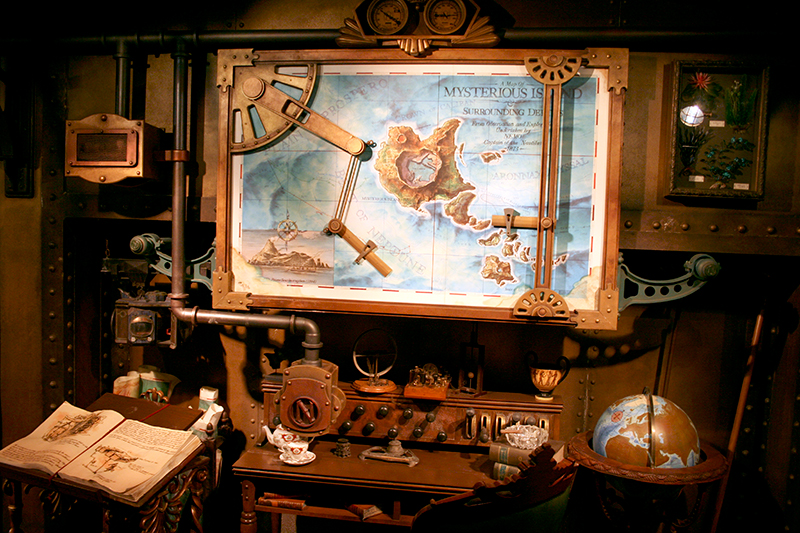
The 'dog leg' turn from the central plaza is evident on the above resort map.

This is because according to the Chinese principles of feng shui, evil spirits can only travel in straight lines. As you walk towards HKDL from the transportation center / MTR line, you can't see the park at all—and neither can those pesky evil spirits.

There are no straight paths throughout the entire resort area (the only exception being the thoroughfare leading up to and including Main Street U.S.A.). All of them wind slightly.

Landscaping is omnipresent, and is groomed in the traditional Chinese classical garden style. The main entrance to the park is orientated in a north-south direction to ensure maximum advantage from the Green Dragon Mountain to the east and the White Tiger Mountain to the west. All doorways at the resort are positioned to maximize the flow of positive energy. Fittingly, cash registers are close to corners or along walls, where such placement is believed to increase prosperity.

In addition to these spatial design considerations, the Chinese obsession with numerology was addressed in various ways. The number eight is the luckiest (Hong Kong’s Bank of China opened on August 8, 1988 to insure future prosperity; the Beijing Olympic Games opened on that same extremely lucky day this year) and the number four is the worst, signaling death. Accordingly, the main ballroom at the Hong Kong Disneyland Hotel, often used for weddings, was intentionally designed with a floor area of 888 square meters, and the fourth floor was deliberately omitted from both hotel properties. You will also find no numerical references (addresses, years, etc.) on main street with the number four in them.

The incorporation of feng shui into the thematic design of the HKDL resort is its single most interesting and unique feature, especially given the design duplicity of Main Street and Sleeping Beauty cCstle (which gives the park a carbon-copy feel)—but it’s only part of the equation. All over HKDL, small details show a distinctly Chinese flourish to the design. This is in marked contrast to the Tokyo Disney Resort, where a more purely American-style approach is favored (the Japanese like to think of going to their Disneyland as like visiting the United States for the day).

For example, just like the original Disneyland, there is a Snow White's Wishing Well just to the right of the castle. As in California, all coins thrown into the fountain are regularly collected and given to children's charities.

Here there have been very conscious efforts to make the wishing well appear (and thus function) more like a Chinese Buddhist shrine. The roof line edges have a slight upturn in the Asian classical temple style, but the wishing well still conforms to the general thematic design of Fantasyland's medieval Bavarian architecture.

Accordingly, the Chinese touches are subtle enough that the well still works perfectly in concert with neighboring Sleeping Beauty Castle.

Just behind the castle and to the right in Fantasyland are the Fantasy Gardens. The very existence of this space in the park's initial masterplan demonstrates a careful consideration for Chinese culture.

This space contains no attraction or show, its only function is a walking place for quiet contemplation—an ancient Asian pastime.

Here too traditional Chinese architectural accents can be found.

The Asian flavors of Tomorrowland are a bit more obvious, and suit the bright, pop-space-fantasy theme of the area quite well.

Roof curves, while still modernistic and other-worldly, still contain traditional upturns on the tip.

The wavy roofline structure of the restaurant buildings at first seems whimsical, but upon closer inspection, it nods to classic Chinese design formats.

Miniature turrets, built using forced perspective, add layers of depth to Tomorrowland's Asian stylings. These small features manage to convey alien planetoids with rings as well as the grand palaces of Imperial China. Again, this is not an attempt at a more direct architectural simulation (as on Main Street)—rather it's a unique amalgam of referenced styles.

The landscaping of Autopia is meticulously groomed in a Chinese classical topiary format, making a drive through it very relaxing (and, given a moment of thought, very traditionally Asian as well).

It's fitting that Disney designer John Hench's original concept sketch for Space Mountain was based on Japan's Mount Fuji—here in HKDL (much more than even at the Tokyo park) the design feels completely at home among these Asian gardens.

Despite the shortcomings i’ve mentioned in previous posts, it is this seamless incorporation of chinese traditional design practices that makes the HKDL resort a rewarding experience. The park is a good example of how theming—in order to be properly received by a specific regional audience—must be carefully adjusted and rethought.

Spaces Really Do Need People – Hong Kong Update 4.

The overall lack of crowds at HKDL made for an unusual visit. At times the park felt like a ghost town, abandoned and eerily quiet; almost as if the majority of the guests were heading home for the day, and I had somehow eluded detection and had stayed behind to explore on my own.

This is not a comment on the park’s popularity, per say—because of the oppressive humidity and oft-rain showers, most of the summer remains an off-season time for the resort. I was also spending my time there during the middle of the work week.

If it had visited during the fall and winter's peak tourist season—or worse, during the Chinese New Year (when even the wait for fast food is nearly an hour)—the experience would have been markedly different.

At first I was delighted. HKDL seemed like mine alone to enjoy. Yet this quickly wore off, and I began to realize that the crowd dynamic is a very strong component of the thematic experience.

Without a population, Main Street U.S.A. comes off as just another movie set sitting idle, awaiting filming.

Similarly, the lack of queues on nearly every attraction (I rode Space Mountain over five times in a row in less than an hour) was a novelty that soon lost its luster.

There simply wasn’t enough time in just five minutes per attraction to adjust to each new thematic environment. Also, without waiting, there is no anticipation built up before each new stimulation. After a short time, every new sight, sound or smell blended together into one long, bland buffet.

A buffet in which everything seems to have been sitting under the heat lamp all day. Like a restaurant with a long wait ("something must be good in there!") draws an even longer one, an empty restaurant excites and invites no takers.

Thematic environments are most effective in an interactive social context; they are, despite my suspicions, better when somewhat crowded with bodies. Not only does the constant flow of kinetic energy add to the liveliness of the designs, but the presence of a community inhabiting the spaces gives them an added touch of reality.

Even if this crowd is constantly posing with cameras, eating and drinking, and chasing enthusiastic children—the dynamic is similar to any heavily visited site. Tourist behavior is pretty much the same at a real bavarian castle as at HKDL's diminutive simulation.

A site is hardly a sight without the requisite "seers." People needs spaces, but spaces also really do need people.

Future Fantasies – Hong Kong Update 3.

In terms of design direction, I found the Hong Kong Tomorrowland area the most interesting. The original concept at Disneyland’s opening in 1955 was a “World of the Future: 1986” (representing the next return of Halley’s Comet). Walt Disney intended the area to be a constantly revolving and updated showcase of the most current technological advancements in the industrial sector and in transportation—both of which he was personally fascinated by. Projecting this future has been problematic since the earliest days of the park; either your predictions are wrong and turn out laughable, or they are correct and your vision quietly becomes passé. Walt Disney himself saw his land of the future go through three major revisions in just over its first decade (remodeled in 1959 and again shortly after his death in 1967).

When the time came to develop concepts for Disneyland Paris in the late 1980s, the designers had learned from their mistakes—theming requires a degree of control and the future, by definition, cannot be controlled. Thus, as is so often the case with thematic design, they turned to the past for inspiration. Instead of a Tomorrowland, the park in Paris would have Discoveryland—a retro-futurism vision of what past science fiction and fantasy luminaries thought the future would look like. The works of Jules Verne, H.G. Wells and Leonardo da Vinci were carefully woven into a single meta-narrative with a Victorian steampunk aesthetic (see my previous post on Mysterious Island at Tokyo DisneySea for a more in-depth discussion of this style). Besides being a refreshing and innovative theme, the design of the Paris Discoveryland solved a key problem—rather than project what might come to pass, it's easier to fantasize about those that already have.

The approach was so successful that in 1994, a remodeled Tomorrowland at Walt Disney World’s Magic Kingdom opened to rave reviews. Billed as “the future that never was, is finally here,” this reboot injected the original technological utopia with a healthy dose of fantasy (and plenty of neon). Drawing on early twentieth century American science fiction legends such as the original Buck Rogers, the new design featured early modernism combined with 1930s and 40s Art Deco. The focus was again on past visions of the future, albeit this time more recent and definitely more American.

In 1998, the Disney designers once again took a look at the original Tomorrowland in Anaheim and saw the need for change. Taking cues from Discoveryland and Florida’s new remodel before it, Disney gave the area a bevy of (some would argue mostly superficial) alterations, ranging from new architectural accents to new neon lighting effects and a completely fresh color palette of gold, burgundy and emerald. Whatever the extent of the redesign, once again the emphasis was on fantasy and not prognostications. After this flurry of remodeling, only the Tomorrowland at Tokyo Disneyland remains largely what it was on opening day in April, 1983—a white concrete urban utopia of corporate control and technological supremacy.

With the design of HKDL, however, any pretense of futurism has all but been erased from the Tomorrowland formula—this is science fantasy, not science fact.

The architectural features, color palette and graphics style are all playful with an almost comic book vitality. The feel is very, very pop; bright and colorful.

This approach makes sense, given the popularity of sci-fi/fantasy—not to mention graphic novels and manga—throughout Asia; it's a language that the native audience grasps fairly intuitively.

The overwhelmingly whimsical approach is far beyond even the steampunk Victorian stylings of Paris and Tokyo DisneySea's Mysterious Island; well beyond the fanciful neon rings of the Magic Kingdom's "future than never was."

Here in Hong Kong there is, in essence, no tomorrow left in Tomorrowland. I suspect the name was kept only to tie the park closer to the original in California.

Rocket ships carrying humans to the moon and mars have given way to flying saucers and cartoonish alien cultures.

The Hong Kong Space Mountain attraction serves not to launch us to faraway stars—instead it's just a trip around the neighborhood; as for the cosmos, we're already there.

Even the Autopia attraction—a mainstay at Disney Parks since 1955—is decidedly otherworldly; no interstate freeway signage here.

Tomorrowland at HKDL illustrates the difficulty that present-day thematic design has with true, visionary futurism. Modernism and Progress is the name that sociologist Mark Gottdiener gives to this archetype—one in which technological utopia is fused with a sense of "cutting edge" and perpetual becoming—and it's one of the least successful models, if Disney's constant revising at its parks over the years is any indication.

The company's slow retreat from Walt's original "showcase of the now and soon to be now" concept has been gradual, lasting many years and numerous different stabs at a solution.

Now, with the Hong Kong iteration, the transformation from tomorrow to today is complete. The area is basically a Fantasyland with little green men instead of a wicked stepmother.

Copies of Copies – Hong Kong Update 2.

The broad decision to stick with what works makes HKDL something of an uncanny experience for the seasoned visitor.

Both the central Sleeping Beauty Castle and Main Street U.S.A. are near-exact replicas of their counterparts at the original Disneyland in California. There are, however, infinitesimal distinctions evident only to the designers—inside jokes, I suppose.

The Disney press releases state this proudly; it's unique because this is the first time the designers have decided to 'pay tribute' to the original Anaheim park. However, I feel it detracts overall.

Disneyland Paris was charming precisely because it was so uniquely engineered for european tastes. Similarly, the two cloned Cinderella Castles in Florida and Tokyo were designed to evoke a sense of massive scale and provide a landmark visible at a great distance—departing from the small intimacy of the original Disneyland. In all cases, the design was greatly modified, quite intentionally, for the needs of those parks.

Here in Hong Kong, the theme is not so much Medieval Fantasy or Americana as Disneyland itself. The park has become not a thematic representation of other times and places, but a recreation of the 'original' Disney theme park.

This tendency in Disney design to replicate itself has been manifest since the Walt Disney World (second generation) opened in 1971, and has carried through the company's other resorts around the world. But here in Hong Kong it is distilled to the point of changing the formula itself.

This newest Disneyland, in an odd sense, has become a museum to itself.

Instead of HKDL's Main Street being a simulacra of an archetypal small, Midwestern American town at the turn of the twentieth century, it’s rather a copy of a copy. And just like a document duplicated on a copy machine, and then in turn that copy is again duplicated, there is a noticeable loss of quality. Quality and, in the case of thematic representation, authenticity as well.

HKDL's Main Street U.S.A. felt the most patently fake of all the Disney Parks I’ve visited, in ways that I can’t quite describe or explain. Granted, my perception carries with it a certain bias; I grew up close to the original Disneyland, and I’ve visited that park many more times over the years than the average visitor. I could notice, instinctively, tiny details that make Hong Kong’s castle and Main Street feel less concrete, less real than the Anaheim original.

Part of this is just due to the newness; the original Disneyland has been fermenting for over 50 years, changing with each new attraction added or replaced, each new restoration and paint job, each new re-paving and remodel.

In this sense, it is like any other human-designed space; it evolves and continually gains complexity by virtue of its passage through time. HKDL is much like Dubai compared with New York City—an entire metropolis constructed in a split second.

In any case, for the majority of visitors to HKDL (I observed about 80% to 90% Asian, with the remaining ten or so percent being British from Hong Kong, South Africans, Australians and New Zealanders—I saw no other Americans at the park or at the hotel during my visit), these distinctions are moot—this might very well be the only Disneyland they will probably visit; this is Disneyland.

The Proverbial Trees Through the Forest – Hong Kong Update 1.

Continuing my trek through Asia, I left Tokyo, Japan to spend a week at the Hong Kong Disneyland Resort. This is the company's newest theme park (opened on September 12, 2005) and it is also the smallest of all the Magic Kingdom-style Disney Parks. Sitting on reclaimed land in Penny's Bay, Lantau Island, the resort has a somewhat unique development model.

Rather than being owned outright by foreign capital (as is the case in Tokyo with The Oriental Land Company) or by a consortium of publicly traded stock, outside investors and Disney (the case in Paris with Euro Disney S.C.A.), Hong Kong Disneyland (HKDL) is jointly owned by the Walt Disney Company and the government of Hong Kong, via Hong Kong International Theme Parks Ltd. Even more interesting, the government is the majority shareholder; it is unusual for Disney to cede this kind of control to a civil authority (but this was probably a de facto condition of the ownership negotiations).

HKDL differs from its sister resorts in a few key ways, the most notable being the omission of a Frontierland archetype. This is not for lack of interest; the Chinese find the American Wild West just as exotic and exciting as the Japanese and the French. More likely a development of this kind is being reserved for a future expansion—the Disney Company learned the hard way with the Disneyland Paris project that they had built too much too soon (a very expensive proposition).

As a result, the park exudes caution at every turn—from a smaller initial masterplan, to an emphasis on tried-and-true design solutions. Though the interpretations of the classic Disney Park thematic archetypes vary somewhat, overall the park lacks originality; hopefully this will change with future additions (Disney officials promises that two “unique lands” are not far off on the horizon).

The other classic Disney themes (Main Street U.S.A., Adventureland, Fantasyland and Tomorrowland) remain, with the tropical paradise jungles of Adventureland being by far the largest. This area's waterways replaces the frontier Rivers of America moat-and-island model seen at the other parks with a route for the classic Jungle Cruise attraction.

On the island still sits an exploratory playground accessible by raft, but instead of Tom Sawyer or pirates, a Tarzan's Treehouse (similar to the theme of the Disneyland attraction, itself a 1999 update to the classic 1962 Swiss Family Robinson Treehouse) rises high above Adventureland's subtropical skyline.

Adventureland feels most authentic here in Hong Kong, because the resort lies at a latitude that can provide the proper sub-tropical climate for a thriving jungle. It’s only been nearly three years since the park opened—making the planned vegetation itself about four years old—but the growth appears to be double or triple that, with much of the foliage completely indigenous. Florida’s Magic Kingdom experienced similar plant proliferation in its early years (owing to that region’s own heavy rains and humidity), but the original jungles of Anaheim took far longer to settle in.

The subtropics of Hong Kong’s Lantau Island seem out of place elsewhere at HKDL, however. Unlike the desert wasteland that provides Las Vegas with little visual competition—or the easily sculpted orange groves of Anaheim, for that matter—the thick vegetation presents a strong sense of external ‘place’ for the park. In Fantasyland and Tomorrowland, there is a certain disconnect that I suppose, given the park’s location, was inevitable. You might think that the thick vegetation of Florida would have caused a similar disconnect at Walt Disney World, but my impression of the Magic Kingdom there is that Disney spent considerable time (and money) clearing trees and brush away from the park’s perimeter and berm—so much so that you only see the surrounding everglades from the highest vantages.

Disney does, however, leverage this as a design asset in not only Adventureland, but also at the Hong Kong Disneyland Hotel, which sits just outside the park. Built in the style of a nineteenth century grand Victorian resort (similar to the Grand Floridian at Walt Disney World, the Disneyland Hotel at the Paris resort, and the new Disneyland Hotel in Tokyo), the structure nods to the sprawling English, French and Portuguese colonial estates of Southeast Asia.

Seeing the turret tops of the hotel poke through the thick jungle foliage is a charming nod to the region's quaint—albeit tainted—colonial past. The thematic design is made complete by the naturally landscaped setting of Lantau Island, with its green hills and rocky shoreline.

Conversely, I stayed at Disney's Hollywood Hotel down the street (because frankly, it was the far less expensive option) which clashed unpleasantly with its surroundings. The thematic design of the hotel itself—done in a Los Angeles golden era Art Deco style (1920s–1940s)—is executed decently enough, showcasing the usual level of detail and subtlety that Disney is known for.

Yet without the palm tree-lined boulevards and the endless brownish sprawl of Southern California, the theme falls flat. Given the tropical setting, seeing its blue and gold rooftop rise above the lush green skyline is as disconcerting as the Hong Kong Disneyland Hotel’s pink victorian spires are charming.

The natural setting and indigenous vegetation of where a thematic environment is built greatly affects how the design is perceived. A vacuum, although lacking in charm, is probably ideal—think how even more fake and cheap the Las Vegas strip would feel in the shadow of the grand canyon’s effortless majesty.

The thick jungles of Lantau Island—and moreover, the tall, rolling green hills—present an attractive backdrop, for sure, but provide an uneasy staging for the park’s multiple thematic spaces.

Sometimes the effect is better, but more often, it’s a subtle (and omnipresent) distraction. HKDL's castle feels dwarfed by the high ridge line behind it. This ridge disrupts the entire scaling of the park—including Disney’s famous forced-perspective architectural techniques—making it feel like a miniature model of a theme park rather than the real thing.

In this regard, it's the forest that makes it hard to see the trees.

DisneySea Graphics – Tokyo Update 5.

The design of Tokyo DisneySea is quite impressive, and nowhere is this more apparent than in the American Waterfront area. Dozens of signs and printed ephemera dot this vivid representation of New York City at the turn of the twentieth century (1890–1920). The artists at Disney went to great lengths to insure period accuracy in their illustrations, layout and typography. Some of the hand lettering is really nice. Again and again, the effectiveness of a thematic environment often hinges on the smallest of details like these. Moreover, these touches demonstrate the often integral role that graphic design plays in successful theming. I’ve posted some of the more interesting examples below. All artworks are © Disney Enterprises.

Above, framed piece advertising “The Rajah’s Pool,” basement of The Hotel Hightower (as you exit the Tower of Terror attraction). This entire gift shop area is themed in the style of an imperial indian royal bathhouse.

Various advertisements and signage in the American Waterfront area. This example is very Victorian in styling.

Whereas this posting smacks a bit more of Art Nouveau, with touches of 19th century wood type.

Some larger billboards add to the sense of depth, scale, and realism on the rooftops of the american waterfront area. This example leans more towards the latter half of the represented time period (late 19-teens).

Very rarely, a piece will have an actual date attached to it; these tend to fall near the middle of the themed time period.

Some of these vintage-styled advertisements are enclosed in glass frames. copious amounts of text reflect the media of the times.

For a truly authentic look and feel, more than one graphic design movement can be glimpsed on the walls of the American Waterfront. As is the case in actual history, styles of typography and illustration often overlap by decades; in addition, loosely-regulated broadside laws ensured that many advertisements from earlier eras often remained for years before being taken down. The American Waterfront thus showcases wood type from the late 1800s alongside more ‘modern’ color printing examples from as late as the 1920s, for the proper gestalt of an entire era, rather than a fixed year.

True to the period (1890–1920), several massive painted ads adorn the sides of brick brownstones. They are weathered appropriately to reflect the passage of time.

Because the American Waterfront borders the Mediterranean Harbor on one side, a few transition elements were designed to ease the eye through such a leap in time and space. This mural advertisement for olive oil features a scene of the Venice, and appropriately, faces an actual, physical replica of the canals in Italian-themed area across the street. Although residing in New York about 1900, it feels enough at home in the background when viewed from ‘Renaissance Italy’ next door as to not be jarring and incongruous.

One of the finest examples of hand lettering that I've seen at this, or any other Disney Park.

Not content with just framed ads and billboards, the Disney designers have produced and applied (very accurately, with faux wheatpaste) scores of broadsides, fliers and posters on the brick walled alleys of the American Waterfront.

Upon close inspection, one finds detailed references to the politics, popular culture, and social mores of the times. References like this one, indicating Teddy Roosevelt’s popular fame even after he had left office as president, show that the Disney designers certainly did their homework. And this homework is not lost upon even the most casual visitor. Reality is composed of numerous levels of detail and subtle layering—illusion too, if to be successful, must contain the same depth. Graphic design pieces like this add an immeasurable ring of truth to the entire scene, and are one of the cornerstones of good thematic design.

Nautical But Nice – Tokyo Update 4.

My absolute favorite themed port of DisneySea was surely Mysterious Island. Admittedly, I'm quite biased—not only a fan of the writings of Jules Verne, I'm also an unabashed aficionado of Disney's 1954 live-action film, 20,000 Leagues Under the Sea. Add my general love of history—specifically the Victorian steampunk aesthetic—and you can see why I might enjoy the design vision behind this area.

The supervising art director on 20,000 Leagues was Harper Goff, a Hollywood production designer and studio artist. Harper was working for Warner Bros in 1951 when he met Walt Disney in a London model-making shop, and Walt quickly recruited him to the then-burgeoning Disneyland concept team.

After contributing numerous sketches and plans for the development of that park, he was the man responsible for the award-winning design of Captain Nemo's submarine, The Nautilus. Unfortunately, Goff was denied an Oscar because of a dispute with the Disney studio that has never been satisfactorily resolved.

Harper took his inspiration from actual metalworking techniques of the late nineteenth century; iron plates and rivits, and once quoted his wife as calling the overall style of The Nautilus "nautical but nice."

One of Disney' most enduring icons, The Nautilus has taken up residence at three other parks, first at the original Disneyland (in the form of an early Tomorrowland film set exhibit), then at the Magic Kingdom in Florida (at the 20,000 Leagues Under the Sea submarine ride, since removed) and again in Discoveryland at DIsneyland Paris, as an elaborate walk-through attraction.

This time, the folks at Disney took Goff's original designs for the film—combined with what related elements had been previously imagined for the other Disney Parks—and created a complete, cohesive vision for an entire land.

Lead creatives at WDI simply took as a given that Nemo drove Goff's submarine, and then extended that aesthetic—what would Nemo's headquarters, on the literary Verne's "Mysterious Island," look like?

What sort of materials would he employ? How would he construct his retreat deep within, and around, this remote volcanic ocean base?

Everything follows: from the glasswork, to the stained, weathered and oxidized bronze; from to the elaborate metal pipework to the exacting lantern shapes; from the typography on signage, wayfinding and associated ephemera to the vivid color palette.

This impressive beauty aside, Mysterious Island is a curious example of the postmodern nature of thematic design today. I know. Postmodern is a term so frequently bandied about that it seems to have lost all meaning; anything, at this point, can be called "postmodern." Yet specific fields have very different definitions for it—from architecture, to literature, to fine art.

When I associate postmodern with theming, however, I'm using a definition often employed by social scientists—one in which the terms means a breakdown in the referential chain. This chain is the link between source and reference, between original and descendant. A postmodern thematic environment, then, is a designed space in which it is difficult (or near impossible) to separate the inspiration from the execution; a space in which it's very hard to discern fact from fiction, and pop culture from history.

Mysterious Island draws on many ideas that originated in the literary works of Jules Verne; the namesake novel, the novels 20,000 Leagues Under the Sea and Journey to the Center of the Earth (both of which are themed attractions in this area), as well as elements of a lesser known Verne work, Facing the Flag. Yet it also adds the 1954 Disney film into the mix (where most of the design aesthetic originates), and various popular culture notions of the Victorian era and steampunk culture.

Steampunk refers to a fictionalized history of the later nineteenth century, in which many modern-day technological advancements (such as computers, nuclear and electric power, etc.) did indeed exist, albeit using the materials and philosophies of the industrial revolution. It is a form of science fiction fantasy that takes place in the past, rather than an imagined future, and has proliferated, beginning in the 1980s, through literature, cinema, television, comics and video games.

Along similar lines, Discoveryland at Disneyland Paris merges steampunk with the works of Jules Verne (Around the World in 80 Days, 20,000 Leagues Under the Sea, and From the Earth to the Moon) alongside the 1954 Disney film aesthetic, and also draws upon the works of H.G. Wells and Leonardo da Vinci to create a 'past-future' fantasy (sometimes called retro-futurism).

Mysterious Island at Tokyo DisneySea is all of these things—and yet none of them—all at once; literary source, actual history, science fiction fandom, and a key Disney cinematic reference. Yet it’s impossible to tell where Verne ends and Disney begins, or for that matter which is actually Disney creative property and which is appropriated out of the cultural ether. Such is the nature of postmodern thematic design.

Tales of Terror – Tokyo Update 3.

One of Disney's most popular attractions in recent years has been The Twilight Zone Tower of Terror, an elevator-gone-awry freefall thrill ride. Because Japanese audiences are not as familiar with The Twilight Zone television show (and also because the designers had a nearly limitless budget—nearly U.S. $200 million was spent), The Tower of Terror attraction at Tokyo DisneySea is completely unique. It utilizes the same basic ride engineering—yet the architecture, story and setting were designed from scratch, and do not use the theming shared by the original Tower of Terror at Disney's Hollywood Studios in Orlando, or the sister attractions at Disney California Adventure in Anaheim and Walt Disney Studios in Paris.

The thematic design of the DisneySea Tower of Terror is interesting because it’s an excellent example of what I’ve come to call hard narrative versus soft narrative. Hard narrative is storytelling in the literary tradition; there are antagonists and protagonists, and a situational, ‘course of action’ driven plot that occurs over a number of interconnected scenes or acts. This is the narrative format of the campfire yarn, the printed page, the live theater (including its descendants, film and television), and very often, song. There are heros and villains, tragedy and comedy, romance and suspense.

Soft narrative, conversely, is visual storytelling. This includes setting and space, time and place—and often succeeds without any literary, hard narrative support. For example, the ambiance of a restaurant may suggest provincial Europe, the tropics or Ancient Rome through architecture, typography, lighting, landscaping, music and wayfinding, even employee dress—all without establishing any characters or plot. Yet the story is unmistakable, and it is this: you are here. In terms of time, here may be the distant past, the present or a fantasy future—in terms of space, here might be across town or across oceans.

Theming relies heavily on both to captivate and thus transport us. The combination of hard narrative and soft narrative varies from venue to venue; a restaurant or bar requires very little in the way of direct plot, yet a themed theatrical production requires much more. Many amusement park attractions—such as roller coasters—get by just fine without much narrative, but for Disney, it is this detailed storytelling that makes their experiences (and parks) unique.

At Tokyo DisneySea's Tower of Terror, hard and soft narrative are blended seamlessly into a delightful medley. The soft narrative is this: the setting is New York City, around the turn of the twentieth century. The Hightower Hotel—a massive, imposing gothic structure—is offering tours of its impressive collection of relics from around the world. Simple enough; we know where we're at and why.

Probably owing to the rich tradition of folklore and 'fright tales' in Japanese culture, the hard narrative, however, is exceedingly complex. So detailed, in fact, that leaflets in both Japanese and English are passed out upon entering the attraction [PDF]. This art is © Disney Enterprises.

The owner of this hotel is one illustrious Harrison Hightower III—a robber baron character typical of his era—who is also an intrepid world traveller and explorer. Sort of a cross between Teddy Roosevelt (or Indiana Jones for that matter) and John D. Rockefeller. Apparently Hightower had trotted the globe in search of rare antiquities to display in a tour at his hotel.

This literary (hard) narrative builds in successive stages, each of which heightens the level of audience suspense. First, you are presented the leaflet upon entry.

As you make your way through the cue area, various soft narrative elements—such as framed photographs, ephemera, and a stained glass window of Hightower himself—support the elements of hard narrative you’ve already been given to read. You know that there have been mysterious happenings at the hotel, and that a tour of these curiosities is formally offered, but that’s it.

After this main cue area, you’re herded into a second room, in which a cast member (Disney-speak for an employee in public view) reads a spiel from a PA microphone. Because this was presented only in Japanese, I can only guess as to the details provided (at the very least, I was asked to refrain from smoking and taking flash pictures), but it seemed like my fellow guests gained a better understanding of what was in store for them.

After this presentation, you’re moved into yet another room; this appears to be Hightower’s work study. Books line shelves on the back walls, and at the front of the chamber is a desk with business papers, etc. On this desk is an antique phonograph, true to the period, and above it on the wall is a large stained glass window of Hightower and his hotel. I apologize, no photographs were permitted from here on, so I don’t have any images of this part of the attraction.

A cast member enters, says a few words (in Japanese, of course), and proceeds to turn the crank on the phonograph to get it going. She then quickly departs and we are left to listen to—an appropriately distressed and crackly—recording that concludes the hard narrative. Because this audio is only in Japanese, supporting visuals—digitally animated in the stained glass window above—insure that non-speakers like myself still get the gist of things. We are introduced to a certain ancient artifact, a voodoo-looking statue that has the requisite subtle cuteness exuded by all characters in japan. This statue, however, has sinister intentions. It ‘zaps’ Hightower and somehow transforms him into a ghost (I suppose, he was killed, but his presumably brutal death is left appropriately ambiguous for a family crowd) and then Hightower plunges down through an elevator shaft of his hotel.

After witnessing this, you walk down into the basement of the hotel, which appears to be the storeroom for Hightower’s ancient relics that he has collected from around the globe—the centerpiece of which is a large Egyptian-style sphinx. From here you board the maintenance service elevators common to the other Tower of Terror attractions, and experience the freefall thrill ride so popular at the other parks.

Tower of Terror succeeds as a thematic experience because it manages to blend copious amounts of hard narrative—cast member spiel, audio/video presentation, and written handouts—with soft narrative (atmospherics) in ways that do not let each detract from the other; rather, they vigorously support one another to create an immersive environment.

Even the leaflet you are given at the start of the attraction is under the guise of the legitimate ‘tours’ that are being offered by Hightower of his hotel and the collected treasures within—this is not just a informative handout tacked onto a roller coaster. The first spiel is also given as part of this ‘tour’—and only when the cast member cranks up the phonograph do you depart from this tour and learn of the true nature of the haunting and hightower’s death.

The reveal is meticulously planned and executed in stages that increase the level of excitement for the guest and incrementally increase our knowledge of the outcome. All through the power of thematic design—a carefully orchestrated combination of both direct (hard) and atmospheric (soft) storytelling.

Sea-ing Is Believing – Tokyo Update 2.

My second full day at the Tokyo Disney Resort I spent at Tokyo DisneySea. This sister theme park to Tokyo Disneyland opened in September 2001, and is one of the world's most popular—over twelve million people visited in 2007. Sparing no expense, the Oriental Land Company (owner of the Tokyo Resort) spent over an estimated four billion U.S. dollars to design, develop and construct the park. Concepts for a Disney park based on the world's oceans date back to the early 1990s, when the company was considering building at either its Burbank studio location, the Long Beach pier, or adjacent to Disneyland; this development later became the disappointingly lackluster California Adventure.

Instead of the typical lands designation found at other Disney parks, DisneySea uses ports of call for its seven themed areas. At the center is a large man-made lagoon (DisneySea is built on reclaimed land and sits directly adjacent to the ocean) with numerous interconnected waterways that encircle the park. This echoes the revolutionary hub-and-spoke central plaza layout of the original Disneyland (and all subsequent Magic Kingdom-style parks), but is intentionally designed to feel more organic. The strict geometry and symmetry of a central plaza thus gives way to the natural fluidity of rivers, streams and lakes.

After walking through the main entry plaza, I arrived at Mediterranean Harbor. This first port is themed in the style of Europe’s Renaissance and the early age of seafaring exploration (roughly 1300–1500). Rather than the long walk down Main Street U.S.A. to a central plaza, this area opens up in a v-like shape in which guests can venture east or west around the park’s main lagoon.

Italy is the most pronounced, with replicas of several Portofino buildings, the famous Venice Canals as well as Florence’s Arno Bridge—but portions of the design subtly nod to Spain, North Africa, Greece and Turkey as well. As is the case with many Disney designs, the architecture is referential rather than an exact simulation—most features, styling and colors are exaggerated in sometimes obvious, sometimes subtle ways. The overall result is an “impression” of the Mediterranean Coast, not a re-creation—and this impression draws upon both popular and cinematic stereotypes of the region.

Continuing to the left, I walked into American Waterfront, the setting of which is the eastern seaboard of the United States at the turn of the twentieth century. Central here is a meticulous representation of New York City at roughly the same time period as Disneyland’s Main Street U.S.A. (1890–1910), including a nearly full-scale ocean steamer docked alongside. The outer edge of this area pays homage to the small fishing towns of New England.

The design detail here is absolutely stunning and showcases some of the company's most exceptional graphics and typographic work. There is a level of verisimilitude here unparalleled at any other Disney theme park—from the architectural weathering and aging, to the signage and storefronts, to the various print ephemera scattered about in the form of advertisements and postings.

An elevated electric railway (the kind that existed on America’s east coast in the early 1900s) connects the American Waterfront with Port Discovery, which is called the “Marina of the Future.” It functions as the equivalent of the Disney Tomorrowland archetype, yet this port is not modernist in the way of Disneyland’s white concrete utopian visions—instead the area takes most of its design cues from Discoveryland at Disneyland Paris.

There is a subtle Victorian styling to Port Discovery, which serves as a remarkable transition zone to the adjacent Mysterious Island. Located more or less at the center of the park, the theme here is based on Disney’s interpretations of the writings of Jules Verne, and is very strongly influenced by the company’s 1954 feature film 20,000 Leagues Under the Sea. The landmark of Mysterious Island (and of DisneySea as a whole) is Mount Prometheus—a live volcano the same height as Tokyo Disneyland’s Cinderella Castle next door—which erupts periodically with smoke and light.

Behind Mysterious Island, at the far back of DisneySea, I walked into Lost River Delta, which is something of the equivalent to the Disney Adventureland archetype—the theme here is Tropical Paradise and the exoticism of the world’s equatorial jungles, with an emphasis on Central and South America.

Lost River Delta hosts only two major attractions; the designers have left much of this area at the back of the park vacant to accommodate future expansion.

Continuing to the right, I entered Arabian Coast which, as the name suggests, is themed as an Arabian Fantasy. Drawing on the 1992 Disney animated film Aladdin and the stories of Sinbad from Arabian Nights, the designers have fashioned an elaborate world that simultaneously appears true-to-life and out of a children’s storybook. The use of forced perspective, delicate lighting and other stage set building techniques contribute to an atmosphere of friendliness and present the foreign (the Middle East is extremely exotic to not only Western audiences, but Asian as well) without being intimidating.

Especially worthy of note was the color palette, which seems to also have been inspired by techniques employed at Disneyland Paris. Light pastels and deep, striking hues are utilized to give the structures greater presence in overcast gray. This is wise choice, given that both times of year that I've visited DisneySea—January and now June—it was far from sunny and clear.

Right next to this beautiful Arabian fantasy is Mermaid Lagoon, the most unimpressive port at DisneySea. Designed for young children, the entire complex is indoors and features numerous rides and attractions all themed after Disney’s 1989 hit animated film The Little Mermaid. Because it doesn’t reference any cultural or geographic cues, and is devoid of nostalgia, I would say that this is the least successful themed area at DisneySea. Certainly, the concept is striking and the execution detail-laden, but as I’m seeing again and again across the globe, thematic design relies on cultural and geographical references that are imbued with a certain wistful nod to the past (or, less often, a fantastical future). Mermaid Lagoon exists to give a certain film property—and only that film—life, and as such its vision is painfully limited.

My day (and night) at DisneySea was an extremely rich experience, and I would say that it ties with the Disneyland Paris park for best thematic design overall. The level of research and depth of referential material that the park designers followed in their concepting shows through in a painstaking attention to every conceivable detail. Two areas of the park struck me the most—The Tower of Terror attraction and the Mysterious Island port—so I will elaborate on those in further posts.

Size Does Matter - Tokyo Update 1.

I've been going over the notes from my research trip to Asia this past June (Tokyo, Hong Kong, and Macau), so here are some observations about the major attractions I visited—Tokyo Disneyland and DisneySea, the Hong Kong Disneyland Resort, the Venetian Macau, and Macau Fisherman's Wharf.

The Tokyo Disney Resort consists of two adjacent theme parks encircled by a monorail line. In August 2001, I had visited the Disneyland park. In January 2003, I visited to the newly opened DisneySea park. This trip allowed me to spend extended time at both.

Both times I saw the resort as an ordinary tourist and enthusiast, and I didn’t pay very close attention in a serious sense. Returning to Japan this past June for the first time in five years has allowed me to take a far closer look at this lavishly designed resort—one of the most profitable and popular thematic destinations in the world.

Some background; the Tokyo Disney Resort is owned by The Oriental Land Company, which licenses the design from the Walt Disney Company. Disney receives only an annual royalty percentage of admissions, food and merchandise sales. This unique arrangement came about because at the time of the Tokyo project's conception (1979–83), Disney was in the middle of building the EPCOT Center theme park in Orlando, and was severely strapped for cash. The company later came to regret this decision terribly, given the immense profitability of the Tokyo properties.

The first park, Tokyo Disneyland, opened in April of 1983, and is considered “third generation” by Disney designers—meaning that the Anaheim park is the foundation, the Magic Kingdom in Florida is the second iteration, and the Tokyo park uses both as a basis.

To the casual visitor, Tokyo Disneyland would appear to be very similar to the Walt Disney World version, with a few elements blended in from the original Disneyland. Yet there are five very key distinctions.

First of all, the Main Street U.S.A. concept was significantly retooled for Japan, on both cultural and geographic grounds. The Japanese are less familiar with the nuances of a small American town at the turn of the century, but due to the influence of the West during the Meiji Restoration, they have an affection for both European and American Victorian architecture.

Taking a cue from Walt Disney World (which also boasts exaggerated Victorian forms instead of small-town Midwestern Americana), Main Street U.S.A. is thus further homogenized, and also renamed World Bazaar to distance it from its distinctly American roots. The architecture is something out of a Dickens-like fairy tale; it has all the makings of the late 1800s to early 1900s, broadly, but there is no specific reference to latch on to.

You can’t really say that World Bazaar represents any real time or place—and that’s part of the appeal. In addition to these cultural revisions, this entryway to Tokyo Disneyland is completely covered by an elaborate glass canopy, making it an ideal mass shelter in times of inclement weather (it rains often in Tokyo, and snows in the winter).

From a design perspective, this gives the area the feel of a grand European train station, conservatory or perhaps a royal arboretum. The specific layout of the glass panes and ironwork superstructure reinforce this impression.

The second key distinction that sets Tokyo Disneyland apart from its sister parks is the layout of the railroad—it only runs around the Adventureland / Westernland / Critter Country section of the park, and does not make a continuous loop like at every over Magic Kingdom-style Disney Park. There are probably three reasons for this.

First, by Japanese law, any train with more than one station (stop) must be regulated by the nation’s rail authority. If the Tokyo Disneyland Railroad circumnavigated the park grounds with multiple stops, it would be subject to functional and aesthetic alteration that would perhaps hurt the overall design (uniforms, ticketing,  train engine and car layout, etc.). Not to mention that Disney rarely likes ceding control over its operations to anyone, let alone a government regulatory body. With only one stop, the train is legally considered a “ride” and not a transportation system.

Second, the perimeter plan of Tokyo Disneyland did not include a raised berm; rather, only landscaping is used to shield the park from backstage areas and the hotels / parking lot. Riding a train around this boundary would expose guests to these vistas and shatter the thematic illusion of an immersive environment.

Thirdly, the Japanese do not associate classic railroads with Americana (as is the effect at the original Disneyland)—rather such trains are a symbol of the Wild West. Thus it makes perfect sense that the Tokyo Disneyland Railroad encircle only the exotic “wilderness” areas of the park, as a centerpiece of the overall theme.

This also makes the Big Thunder Mountain attraction a great fit for the park.

It contains elements from the both the Disneyland and Walt Disney World versions, along with some unique feature as well. 

The layout for the attraction and the Tokyo Disneyland Railroad route interact much closer than at either of those parks.

Thi dynamism is delicately designed and plays marvelously.

The third way in which the Tokyo version is distinct from other Disneyland style-parks is that Frontierland is renamed Westernland. This is because the Japanese have no ready concept of what a frontier is. Being on a small set of islands with extreme population density, there has never been anywhere to go—so the idea of a vast land out on the edge that is largely unsettled is completely foreign.

The Japanese do, however, have a very romantic notion of the western cowboy (owing mostly to the mass popularity of western films starring John Wayne and Clint Eastwood), and understand what a westernland is (and where it is, and what it represents) almost instantly.

This makes Westernland the largest area of the park, just as Frontierland is at Disneyland Paris. The wide-open feeling of the American Southwest is accentuated in every regard, from the detailed rockwork to landscaping.

There is also a quaintness to the structures in this part of the park, almost like the feeling conveyed at Disneyland’s original Main Street. It’s markedly different from the “Ghost Town” feeling at the stateside parks, or even Disneyland Paris, for that matter. Again, this is probably done to better meet the expectations of the Japanese, based on what they’ve read and seen in their media, and in ours. The representation dictates the reality.

The wilderness—"wild-ness"—is all-encompassing. and, in contrast with the extremely dense urbanity of Tokyo around it, very refreshing and beautiful. I saw many Japanese just walking quietly, taking it in, near the banks of the water features.

Fourth in terms of difference from the other Disney Parks is Tokyo's Tomorrowland. The future has always been a troubling area to theme, and as a result both Anaheim and Florida's versions have been re-done to convey a nostalgic 'past-future' fantasy (sometimes called retro-futurism). The Discoveryland at Disneyland Paris was designed this way from the start.

After this flurry of remodeling in the U.S., only the Tomorrowland in Tokyo remains largely what it was on opening day in April, 1983—a white concrete urban utopia of corporate control and technological supremacy. This design was based on both the earlier 1967 version at Disneyland, and Walt Disney World’s original 1971 opening day version.

In the early 1980s when the park opened, Japan was at the height of modernization and its economy was gearing up to be the envy of the industrial world. The overall views of corporatism and technocrats that reigned supreme then are still held by many Japanese.

i wonder if the Japanese view their Tomorrowland, then, as a 'past representation of the future' and hold a certain nostalgic attachment to it as a model of 1970s–80s technologic optimism.

Certainly here in the U.S., it is a design period (and philosophy) that fails to capture current audiences' imaginations. But in Japan, it still has currency.

What's most nostalgic for Americans is the period of middle-class prosperity immediately after World War II (1950s), but for the Japanese this same wealth didn't come until decades later; it's this period that their Tomorrowland represents.

Lastly, my single strongest impression of Tokyo Disneyland was its sheer size and wide open spaces. Again, being so population dense, especially in Tokyo, the Japanese absolutely revel in being able to walk around freely in recreational spaces.

The World Bazaar avenue is wide and spacious, the Central Plaza hub seems endless and lush with landscaping, and even the small attractions of Fantasyland are given wide berth.

The Central Plaza here is easily three times the size of the original in Anaheim. This takes a cue from Walt Disney World in Florida, which also has a larger Main Street, larger plaza, and an identical, towering Cinderella’s Castle.

In Westernland particularly, the walkways and paths are at times triple the width of their stateside counterparts, which means, practically, that Tokyo Disneyland has nearly triple the capacity that the Anaheim park has—and the annual attendance figures to prove it.

Conversely, the tight layout of the original Disneyland is intentionally designed to feel delightfully intimate when compared to the sprawling, impersonal spaces of Los Angeles and the greater Southern California area.

In Tokyo, however, size does matter.

Hershey Dreams – New York Update 2.

Ask any New Yorker if they would recognize the Times Square of now even just fifteen years ago, and the answer is invariably an expletive followed by "no way." This central Manhattan district underwent redevelopment in the mid-nineties, transforming it from a seedy porn theater row into a brandscape powerhouse. Gone are the strippers and dealers—in their place are Mickey and Minnie, Nike and Ruby. The standout thematic attraction of the new Times Square wasn't produced by Disney, however. it's the Hershey Store. Designed by the Brand Integration Group (BIG)—an experiential, intensive laboratory of the global advertising giant Ogilvy and Mather—this remarkable retail space at the corner of 48th and Broadway blends the two extremes of the thematic spectrum—pure simulation and pure brand—into a delightful medley.

A few years back, an article in Fast Company provided the following insights by Brian Collins, executive director of BIG. "if you go into the Hershey Store," explained Collins, "what you have is an opportunity to live the brand in all five senses. music, what it tastes like, what it smells like, what it looks like." BIG's mission was to create a physically branded space that relied on visual storytelling to convey the Hershey brand. "In the case of Hershey, they had incredible mythology around chocolate making that had been hijacked in many people's imaginations. If i asked you to name America's favorite chocolate bar, you'd say Hershey. If i asked you to name the best chocolate factory, you'd say Willy Wonka because of storytelling," reasoned Collins. [emphasis mine]

The space works because the exterior feels suitably organic; it looks as if the Hershey Store itself—rather than just the company—has an actual history spanning decades. Each physical item in the intensive advertising montage on its roofline looks as if it had been added incrementally. This layered history was exactly the effect that Brian Collins and the Brand Integration Group were going for.

“Let’s look at it as architecture, not as a billboard,” Collins told Fast Company. “What would have been here? They would have been here since 1914. First floor, 1910. Second floor, 1930. Third floor, 1940...We’re designing a story...Looking at Times Square and its history, we decided that it’s all about layering. It’s about seeing the past under the present...The fact that they emerged over time meant that we could use the iconography from Times Square,” he noted.

The interior, full of piping and industrial works, followed in a similar vein (though I found it much less impressive).

In this way, the Hershey Store incorporates thematic simulation; an imagined company history of the actual retail space. Although it doesn’t simulate any particular era or locale—like a cowboy apparel outlet might resemble a ghost town from the Old West, or a tropical poolside bar might appear to be an actual island retreat—the store simulates the idea itself of having been at that location for many years, and having endured many alterations and additions over time. It is something I haven’t yet seen—the historical theming of an otherwise non-themed branded space.

Atlantic City – New York Update 1.

My trip to New York City this past May was an interesting experience. I was in town for personal reasons, but thought I'd add on some thematic exploration. Two places immediately came to mind; the Times Square District, and the Las Vegas of the Eastern Seaboard—Atlantic City.

I hopped on a late night bus with my friend Jenn Frank and by the time we arrived in The Garden State at Harrah's, it was nearly 4am. We decided to stay up all night milling around and return to NYC by noon.

Atlantic City has an interesting history; it’s long been a pleasure center for the rich elite; by mid-century, it was a destination for the middle classes as well. More traditional amusement park attractions have been here since the early 1900s, but the legalization of gambling in 1976 brought larger Vegas-style resorts. Many of these are owned by the very same corporations as their Nevada cousins, and many of the same entertainers stop through town. Similar permanent shows call Atlantic City home; in fact due to a Mafia crime wave in the early 1980s, New Jersey was prefered by many over Vegas for years.

The theming is also similar to what you would find in the desert of Nevada—that is, a decent design attempt (with minimal consideration to subtle detailing), yet sub-par when compared to Disney's offerings. We made our way through the Wild west, past Caesars, and out to the boardwalk, where we continued north up to Trump Taj Mahal, then back down again. Like Vegas—and most other casino environments—Atlantic City is a varied cropping of themes; a random visual collage.

What i noticed most about Atlantic City was the incongruity of the ocean. Fantasy worlds succeed best when they have no natural features (read: beauty) to compete with. Las Vegas sits in a desert wasteland; Walt Disney World was built in the middle of a swamp. But Atlantic City stretches along a very pleasant coastline, and as such, the themes of the various casino hotels are almost lackluster in comparison. The bluntness of casino thematic design is difficult enough to suspend disbelief for; next to such competition, it's near impossible.

The Wild West theme suffers the greatest—not only is the ocean prettier, but it shatters the illusion completely to walk out of a ghost town full of prospectors, miners and cowboys to set foot on...a sandy, very eastern, shoreline. What is essentially Martha’s Vineyard next to Caesar's Roman Empire doesn’t do any better.

Good theming—successful immersion—relies a great deal on control. Control of presentation, of perception; of setting, of seclusion. What makes the ocean—literally the ends of the earth—so compelling is the very lack of this control it symbolizes. We humans are creatures of free movement and free will; as such, no matter how compelling the controlled simulation might be, the endless, open, and untamed will almost always seem more fascinating by comparison.

When forced to choose the gambling funhouse and the deep blue of the Atlantic, I must say I favored the ocean. Maybe Atlantic City would have made a greater impression on me isolated and landlocked. Next to such a natural wonder, it just felt shoddy and sad.

Then again, I had been up all night.

Wild Wadi Waterslides – Dubai Update 6.

After hitting the slopes of Ski Dubai for a couple of hours, I took a taxi right across the highway to the Wild Wadi Water Park. Wild Wadi is unique in that it was designed with elaborate theming and an extensive backstory based on the voyages of Sinbad the Sailor, a well-known figure in Arabian folklore.

Most other water parks in the world, such as Raging Waters and Wild Rivers in Southern California, are fairly devoid of theming and focus more on the rides. An exception to this is Walt Disney World, which features two themed water parks—Typhoon Lagoon (with a tropical paradise theme) and Blizzard Beach (with a unique ‘melted ski resort’ theme).

Apart from the usual slides, wave pools and inner tubes, Wild Wadi has incorporated the water conduit system throughout the park directly into the architecture—all tied into the general Arabian Fantasy theme.

According the backstory, Juha and his friend Sinbad are shipwrecked after a storm. Bored at the lagoon where they are stranded, Sinbad directed his crew to create waterslides out of the natural rock formations. The cast of characters (drawn in Disney-like fashion) from this story are the mascots of the park, and are seen on everything from retail displays to safety signage.

The theming is a mix of Tropical Paradise and Arabian Fantasy. All of the water slide support structures look like they could have been built from materials found on a deserted island, and the water conduits resemble an ancient aqueduct.

The overall design of Wild Wadi is first-rate for a water park (which due to the nature of their attractions, are more difficult to theme than traditional amusement venues), but second-rate in comparison to the likes of Disney. Amusement Whitewater, the firm that did most of the design and fabrication work, probably had a much smaller budget to work with.

That I could start the morning skiing and then take a cab to ride water slides in the scorching sun, however, could only happen in Dubai.

Indoor Ice & Digital Fire – Dubai Update 5.

Probably the most bizarre experience I had in Dubai—and this is saying quite a bit, given the city’s general surrealism—was my second to last day, in which I both skied indoors and went to a water park in the same day; the two are actually only a short cab ride apart. By virtue of their common parent owner, i was able to visit both Ski Dubai—located inside the massive and largely-unthemed Mall of The Emirates—and Wild Wadi Water Park with a single, specially-priced combination ticket.

Indoor ski areas are not exactly new. The first such venue opened in Australia in the late 1980s (since closed), and the world’s largest is currently in The Netherlands. But what makes Ski Dubai so unique is not only its attention to detail with regards to thematic design, but the amplified awe provided by the snow’s extreme contrast with Dubai’s climate.

It is perfectly conceivable to be skiing in the summer months at a constant 23F while the actual temperature outside is approaching 130F—and it’s just these sorts of scenarios that make Dubai uniquely surreal. Not “fake” as some commentators have suggested, but a compelling collage of environments and amusements—recreational life in a giant contextual blender.

I spent two hours on the indoor slopes, which are divided into a few beginner and intermediate runs, and an “advanced” run that boasts slightly more speed and a steeper grade. There is a single quad chair lift that runs up the middle, and you can disembark midway (at the site of the themed Avalanche Café) for the beginner side of things, or continue up to the top for the intermediate (left side) or advanced (right side) runs.

Ski Dubai offers an extensive ski school program for both youth and adults (which makes sense, because how otherwise would a Dubai native learn in 100F+ heat?) And you can get a day pass (good from open to close) or a two-hour ticket. Both include all the equipment rental save gloves—which, I was told by locals, are not rented because of the Arab cultural taboo related to the left hand (unclean). The latter worked out perfect for me, since I am an experienced skier—at the end of my two hours I had definitely grown bored of the place. It would have been pure monotony to continue skiing the same two runs all day.

Again, what’s startling about the place is entering it from the outside climate. I spent my time on the slopes trying to remember that it was nearly 95F outside. But more interesting was the theming employed, both in the restaurants and on the slopes. The other indoor skiing venues I looked at online—in Japan and elsewhere—were just as unreal, but not as surreal.

Ski Dubai’s snow recreation area, for those who don’t wish to ski, was built with Disney-like attention to detail, including evergreen landscaping and aged timber wood.

The Avalanche Café (not sure about the name…it doesn’t conjure the most pleasant mountain memories) midway up the slopes looks just like a secluded chateau in the Alps, with the appropriate architectural flourishes and distressed stonework.

The thematic highlight of Ski Dubai, however, wasn’t in the snow but overlooking it—the St. Moritz Café. Done in the style of Swiss ski lodge, the restaurant features a Western (America / European) menu and the walls are covered with print ephemera and photographs from the golden age (1930s—1950s) of ski resorts all around the world. And in the center of it all, there is a large chimney with four fireplaces that face out towards the seating areas. Except they aren’t real fires—each hearth is a digital flatscreen running a seamless loop of burning fire. The effect is augmented with bits of logs and wood chips at the base of each screen, and a small space heater vent above each “fire” that gives off just enough warmth to fool the first-time guest.

I did a double-take, and then a triple-take. But before you cry foul, however, it's nice to note that these fireplaces are completely non-polluting, and probably consume less energy overall than their analog equivalent.

Dubailand – Dubai Update 4.

I’ve been so busy with travel lately that I haven’t had time to update this blog. Here are the last few posts from my notes on Dubai, before I move on with documenting the rest of my travels. After a full morning at Wafi City Mall, I took a long cab ride beyond the edge of the bustling city to the fringes of the desert, where the massive Dubailand parcel lies.

And by massive, I mean three billion square feet (278 km² / 107 mile²)—a site that will include 45 mega projects and 200 sub-projects. There’s not much out there right now, save for a snazzy visitor’s center chocked full of concept art and scale models—but once the four initial phases are completed sometime between 2015 and 2018, Dubailand will be twice the size of Walt Disney World near Orlando, Florida. Think about that for just a moment. Disney World is the largest private recreational property in the world, and it spans 47 square miles—about the size of San Francisco, or twice the size of Manhattan. Dubailand will be just over twice that size—107 square miles.

Everything sounded like so much marketing and developer hype as I read about it before leaving for my Dubai trip, but once I arrived at the visitor’s center and had a look at the impressive masterplan model (which took up its own entire room), I was a believer. True, the only thing moving about Dubailand right now (late spring, 2008) are the scores of heavy equipment pushing dirt around, but what is planned—and what major entertainment corporations from all over the world have pledged to invest billions in—is unprecedented, and it is the future of ThemericaEveryone from Dreamworks to Universal to Marvel to Busch Gardens to Six Flags have signed on.

What distinguishes Dubailand from other such projects—besides its sheer, unnerving scale—are two key concepts that began with Walt Disney World in Florida: the privatization of governing bodies (through  WDW's Reedy Creek Improvement District), and the extension of thematic design across multi-use developments. Disney World was, in effect, the merging of traditional modern urban planning with the immersive philosophy of theming—and all of it effectively privatized. Instead of merely controlling the visitor’s experience within an attraction, or a land, or a park, the control—and seamless unifying aesthetic—is manifested at even the infrastructural level. Walt grabs hold of you the minute you set foot in WDW, and your experience is a completely holistic (and Disney) one until the moment you leave the property.

The semi-autonomous status of Disney World has been troubling to commentators for years, who note that in an effort to provide Florida with a massive influx of tax revenue and jobs, state and local officials gave Disney practically everything they asked for. Amazingly, the company even has the right to build and operate its own nuclear power plant on the site—a right, like every other granted to Disney, that exists in perpetuity.

Dubai, however, is not a democracy by any stretch, and thus governance within the Dubailand complex is not likely to be an issue for its development (Sheikh Mohammed, ruler of Dubai, holds 99.67% of  the company that owns and will operate Dubailand). Most interesting is the emphasis on multi-use; landowners will be able to live within Dubailand, and thus live fully within the walls of a thematic environment.

Dubailand will include theme parks, hotels and resorts, entertainment complexes, golf courses, shopping venues, and commercial properties in addition to residential spaces in the form of luxury villas, smaller housing plots and higher-density apartments. The entire project plays with the traditional role of zoning—which separates land according to use to better balance overall property values.

What will life be like living in Dubailand? Where shopping, entertainment, sports, leisure and shopping are blended together into a single immersive environment, unified by the principles of thematic design? I would be very interested to return in ten years to find out.

Wafi City Mall – Dubai Update 3.

Yes, it has been over a month since my last post. The end of the semester was hectic as usual, so I’m compiling these last few entries on Dubai from my notes after the fact. This past week I was in New York City, and next week I leave for Tokyo and Hong Kong. Before those trips, however, I’d like to complete my thoughts on this past April.

On my second full day in Dubai I visited Wafi City Mall. This complex, rumored to be owned by the Sheikh’s sister, is probably the most luxurious and exclusive shopping mall in Dubai. The sprawling grounds feature high-end name brands and high-end theming to match. The message here is one of the past; predominately Ancient Egypt, although Greco-Roman and the Indian subcontinent are represented as well. The exteriors take their cue from the pyramids at Giza, the Valley of the Kings, and the ruins down the Nile at Luxor.

In this regard, i was reminded of the latter’s namesake hotel in Las Vegas, with its giant sphinxes and meticulously reproduced hieroglyphics. And just like the Luxor Las Vegas, the past as seen here has an extra layer of gloss—of bling—added on top. The use of gold and jewels is impressive, and is designed to appeal to a very discriminating type of consumer. Shoppers in Southern California’s Beverly Hills or Manhattan’s Fifth Avenue would feel very at home here.

Wafi City illustrates very clearly the nature of theming in Dubai. In Las Vegas, as in most other American thematic venues, the purpose is overwhelming escapism. Anything seen as exotic or foreign is perceived as most exciting, and thus most desirable. Tropical locales, European cities, and medieval fantasies—all find home in the deserts of Nevada. Not so in the deserts of the United Arab Emirates. Las Vegas wants you to forget—Dubai is desperate for you to remember her. Nearly every example of thematic design represents a very specific vision, a dream of glories past. Specifically Arabic culture, and Islamic culture (including the parts of Asia where Islam has spread and taken root) in general, is the focus.

This serves to provide Dubai with a past legacy that the city has never really had. Dubai, by any measure, is a product of the twentieth century. The area didn’t evolve from being a backwater port and pearl diving village until after the oil began flowing in the 1950s. Even then, most of the city as we see it today is less than twenty years old. Yet Dubai must have a past in order to secure a future, and that’s where theming comes in. The shopping malls, entertainment complexes and resorts tell a story that real ruins and actual artifacts cannot—they assert that Dubai somehow has the grand lineage of a city like Damascus or even Mecca.

One of the primary purposes in preserving the past monuments, artifacts and architecture of a culture is celebration. I assume that the message is just as strong for residents; as a visitor the impression is unmistakable. Dubai is resoundingly paying tribute to the Arabs—and all the Muslims—that came before it the way any other city in the region would, except she has no actual remains to offer up to the Museum Gods. She must craft them out of whole cloth, complete with parking garages and escalators.

DEAL 2008 – Dubai Update 2.

Wi-fi had been spotty in Dubai, so now that I’m back in the U.S., I'll start to post all the bits that I wrote while I was over there.

On sunday the twentieth I visited the DUBAI ENTERTAINMENT, ARTS & LEISURE EXPO (DEAL) at the Dubai World Trade Center. Sheikh Mohammed stopped by ever so briefly, as he is known to do all over Dubai without notice, shook some hands and left. His massive entourage (devoid of any explicitly visible security) passed right by me, though I can’t admit to being starstruck. The expo on the whole was something of a disappointment—there just weren’t as many representatives of the theming industry present as I had anticipated. Most vendors were manufactures of ride equipment, systems integration (ticketing, point-of-sale, etc), and waterpark attractions.

The few conversations I had, however, were very fruitful. I spoke with Brendon Poole, creative director at Cat Décor. A South African who has been living and working in Dubai for over five years, Brendon, like many thematic designers, got his start in the film industry. He began his career as a prop and set designer / fabricator, and then worked full time as a storyboard artist on such films as From Dusk 'till Dawn before starting his own company. Brendon re-affirmed my contention that the language of film—what Anna Klingmann calls “storyboard architecture”—is inexorably linked to theming. His comments were quite insightful.

I also met with Peter van Bilsen, Senior Vice President, Marketing and Sales for Vekoma Rides Manufacturing. The designer of most of the world’s premiere roller coaster and thrill rides (here is a comprehensive list), Vekoma is based in the Netherlands, and is known for its tight collaboration with Disney in producing many of the attraction ride systems for their theme park. Mr. van Bilsen was kind enough to elaborate on how the creative process operates between the two companies. The fact that they have worked together on so many different projects over the years—a relationship spanning over two decades—has lead to a very streamlined and tight collaboration.

As Peter put it, when a new ride is given the green light by management, the Disney folks “know exactly who to call” at Vekoma, and the production meetings are set almost automatically. In speaking with Mr. van Bilsen, it became even more clear to me how secondary the engineers and are to the overall thematic creative process. Only after the narrative has been developed, the concept art, storyboards and models built—are the “math people” called upon to make the rides actually work, and the structures actually stand.

Another interesting conversation I had was with the folks at Theme World, the Gulf representatives for U.S.-based Biscayne Aquaculture. Headed by Gordon Cruickshanks, who actually worked on the famed Lost City theme park in South Africa, Theme World specializes in “recreating natural and historical environments.” Their parent organization, biscayne, had worked for years to produce rockwork, water features, and landscape architecture in the states, for many notable projects, both private residential and large scale. I spoke with both Mark Bryan, who noted that the demand for themed projects in Dubai is “unprecedented” and Lynette Widmeyer, who offered some fascinating insights into her personal philosophy of placemaking.

“Not only does the theming of natural and historical environments take visitors away from the everyday,” she told me, “these spaces cause people to remember who they are…to return to where they should be.” Theming, in her view, is not about escapism, but rather about affirmation of identity. Water in landscaping, she felt, was especially key to this process. “Water is the most natural, tranquil, serene substance on our planet. It refreshes, revitalizes—and to see and hear it in motion is a spiritual experience.”

Along the lines of water, I also spoke with John Cussen of Amusement Whitewater, a firm that has perhaps the most thorough resume for themed water projects in the Middle East, in addition to a long list of stateside projects (including several at Walt Disney World). They completed partial design, fabrication and installation of the Egyptian section of Ibn Battuta Mall, Wild Wadi Water Park, Ski Dubai, and most recently Atlantis The Palm—a sister resort to Atlantis in the Bahamas—opening in September as the gateway to the Palm Jumeirah.

Even though I had hoped for a greater representation of the theming industry at DEAL 2008, the contacts I did make were valuable and I hope to follow up with most of the kind folks I talked with and perhaps interview them more formally in the future.

“Modern Antiques” – Dubai Update 1.

I’ve been in Dubai for two days now and it is delightful and overwhelming all at once. After meeting up with family friends for a drink at Barasti (a beach bar beside the Palm Jumeirah) the night I arrived, I started my first day at the Ibn Battuta Mall. Named after the 14th century explorer, the massive mall is divided into six areas called courts.

Each is themed as a different region of the Islamic World where Ibn Battuta traveled: China, India, Persia, Egypt, Tunisia and Andalusia (Moorish Spain). The architecture is very Las Vegas-esque, with a sky-painted ceiling that appears to move if you stare at it long enough. Winding streets and alleys with forced perspective rooftops and second stories complete the illusion. Perhaps predictably, the Arabian regions have a far more authentic feeling.

The China court is the most kitschy; straight Chinatown Hollywood gloss. It seems the further you get from Arabia, the closer you get to Hollywood representations. The stereotypes seem universal—the China here is done the same way China is branded in the U.S. at restaurants, etc.

There is a strong educational focus at the mall, with elaborate displays related to each culture, showcasing early technology in the age of exploration (shipbuilding, early flight, navigation and mathematics, etc.). This exemplifies how commerce blends seamlessly with education, religion and entertainment in Dubai. There is no clear line between shopping, learning playing or praying on this liberalized, Western, secular island. It’s all one big mix.

after spending several hours at Ibn Battuta, i moved on up the coast to Madinat Jumeirah, a themed luxury resort complex of considerable size. The design replicates ‘Classic Arabia’ and provides the feeling of older, more authentic cities such as Cairo, Mecca or Damascus. Because Dubai was a fairly small and unremarkable town until oil was discovered in the 1960s (which began the region’s rapid growth), and also because nearly anything of historical value has been destroyed or displaced by the building craze of the last twenty years, there is very little original, classical Islamic architecture here.

As a result, Dubai is somewhat insecure about its lack of roots. Most, if not all, the major resort developments are themed to provide a history that many feel does not exist. The illusion has become the surrogate. Thematic design providing historical context in the absence of a real past is nothing new. However, an Old Dubai still exists here, in the form of Deira and Bur Dubai, the two oldest neighborhoods that border the creek and comprise pre-oil Dubai. This is the older, more authentic part of town that these newer, thematic resorts are trying to replicate in a very romanticized form.

The older and more authentic parts of Dubai are often shunned by the elite traveler in favor of the themed replica. It’s not that these places are shady or poor, either—by all accounts these neighborhoods are perfectly safe for tourists. But there is a certain packaged, predictability to the themed resorts that the richer tourists seem to crave. In visiting both, I will be able to directly compare the theme to the original source—something that can rarely be done at the same location.

There was a sign at the Ibn Battuta Mall that you could only find in Dubai—the sort of oxymoron that typifies the real and the ersatz living side by side. The proprietor of a small cart offering lanterns and other trinkets proudly proclaimed himself to be selling “Modern Antiques.” And I think that’s the best shorthand for Dubai that I’ve seen so far—seeking to look and feel ancient, yet so proud to embody a futuristic urbanity. Seeking both a future, and a past.

Transition Zones. Brandscapes Clashing with Pure Simulation – Disneyland Paris Wrap-Up.

I’ve been home for a week now, and I’ve been going through my copious notes reflecting on my time spent at Disneyland Paris. Most observations align quite well with what I’ve seen elsewhere. Successful thematic design—like architecture or graphic design—is remarkably consistent. Similar grammar, techniques, thinking, etc. What works, works. And on that same note, what doesn’t work (see my earlier post on the Walt Disney Studios park) just doesn’t.

Altogether, the Disneyland Paris park is the most remarkable example of thematic design I have seen in my research thus far. Tokyo DisneySea, which I visited once in 2003, is definitely on par, but I was looking at it back then through the eyes of a tourist and not a critic. When I return to Japan for research in June, it will be interesting to give it a second, serious pass (and in direct comparison to the Paris park). Again, much of this is owed to the fact that the Disney organization felt compelled to top themselves in order to win European audiences. And top themselves they did.

In going back through my field journals, I have highlighted some specific observations. I will discuss two of them here. First of all, transition zones. All Disney parks are composed of multiple thematic environments, usually delineated by ‘lands’ or sub-lands. When two or more themes bump into each other, there are specific design challenges as to how guests experience the transition in between. Above all, it cannot be jarring. Any cause for pause can disrupt the illusion and the guest’s place in the story. Beginning with the original Disneyland park, the designers have paid special attention to these areas.

For example, a building between two lands shares a roofline, evenly split down the apex from one side to the other, or the style of pavement morphs from brick to cobblestone.

The most remarkable such transition I’ve seen was pointed out to me by Gabor, my private tour guide, on our two-hour stroll through the Paris park. Take a careful look at these next two pictures—the first being Adventureland and the second, Fantasyland.

The two lands are separated by a small covered bridge. All of the bodies of water are connected, underground or otherwise. So on the Adventureland side, the theme is tropical paradise. The waterways are rough and rocky, with many flowing streams and rapids. The foliage is wild and overgrown.

The Fantasyland side is extremely groomed in the orderly nature of an English garden; it is a medieval fantasy theme, yet of a very particular type—the complete opposite of its neighbor, essentially. The Disney designers have used this covered bridge as the barrier between the two themes. So the moment you cross over, the very same moving body of water transforms, almost by way of magic, from the wilds of the tropics to the tame serenity of a classic European estate. Maintaining proper transition zones is essential to preserving the illusion of multiple themes integrated within the same environment. What Las Vegas often does poorly, for example, (by way of multiple owners and a varied development model) Disney produces very, very well (by exercising complete creative control).

Second among these journal notes pertains to the Disney Village retail and dining complex, designed by renowned contemporary architect Frank Gehry. It’s not that the environment (or rather, environments) is poorly designed—in fact, as to form and function, it succeeds both aesthetically and commercially. However, Disney Village was very revealing in how the two extremes of my thematic vector—pure brand and pure simulation—interact.

Disney Village sits more on the brandscape side of things; this stylistic row of shops and restaurants is much more akin to Jon Gerde’s Universal Citywalk than Disney’s park next door (which is more pure simulation). In addition to the retail spaces enclosed in Gehry’s rather avant garde structure, the space includes a number of what I would call ‘traditional’ thematic venues:

  • Annette’s Diner – An American burger joint in the 50s nostalgia theme
  • Rainforest Café – A popular chain in the tropical paradise theme
  • Planet Hollywood – one of the last remaining locations of the ailing, bankrupt chain, themed in Hollywood memorabilia
  • King Ludwig’s Castle – A german steak, sausage and beer restaurant in the medieval fantasy theme
  • Billy Bob’s – A restaurant, saloon and music venue in the wild west theme
  • Hurricanes – An all-night dance club in the tropical paradise theme
  • The Steakhouse – a restaurant in the Wild West theme, but more of the Great Plains and Chicago than the far West

Standing alone, the Disney Village does an excellent job as an upscale, varied shopping and dining complex. It is a perfect brandscape in the Jerde tradition. However, next to the pure simulation of Disneyland Paris (and, to an extent, the Walt Disney Studios) it falls flat. I think that brandscapes in direct comparison to ‘traditional’ thematic spaces create an uncomfortable juxtaposition—one that derides both formats. Each style of thematic environment operates on different assumptions, and asks different things of their audiences. In designing Universal Citywalk, Jon Jerde specifically stated that he wanted to avoid pure simulation in the Disney vein, and instead present a collage pastiche of inflated iconography. His Citywalk reads like a daydream of Los Angeles; the design hints at much, yet resists referencing anything specific. Disney Village was conceptualized on very similar terms.

On the contrary, the Disney vision of pure simulation (again, what I call ‘traditional’ theming) thrives on the specificity of its design references. The Disneyland park model is a holistic design concept that envelops the guest in the narrative, using cinematic cues to construct a tightly controlled (and thus a very heightened) experience.

The Disney Village in contrast presents itself to the viewer much as a traditional architectural program does—one is not enveloped or involved, rather one is forced to respond in a subject/object relationship.

As a result, to stroll from one to the other is jarring, and raises the kind of awareness that removes the guest from the illusion that theming is trying to convey. Disneyland park looks too cute, too kiddy, not serious enough, next to Gehry’s architecture.

And Disney Village, in turn, looks like a stern taskmaster in the face of Disney’s openness and gaiety. Designers of thematic environments would do well to separate the two—within the same user experience they both lose their luster.

Anywho that’s it for now on Disneyland Paris. Next stop is Dubai.

Typography on Main Street – Disneyland Paris Update 4.

Main Street U.S.A here in France has really got me thinking about the specific role that graphic design plays in theming. The examples I have seen are truly astounding. Disney in general has always had a good handle on vernacular re-creation, and the Parisian park’s Main Street is no exception.

However, although the parks stateside do a solid job, the designers have outdone themselves here. The reasons are twofold. First, Disney was given the specific mandate to impress European audiences. And second, creating a Main Street that made sense to the European conceptions (or misconceptions) of American culture and history required that the basic formula be rethought.

So, not only did they have go above and beyond, but Disney’s creatives needed to innovate. And in graphic design, impressing and innovating produces really stellar work.

The original Main Street U.S.A. in California is all about a nation in transition—from gas to electricity, from horse to automobile, from telegraph to telephone. This basic theme is repeated in Paris; however, the commercial (read: capitalistic) aspects of American society are grossly amplified. For the first time, billboards and advertising broadsides of all kinds are peppered throughout main street, becoming as strong a design voice as the architecture itself.

Which means some truly spectacular examples of period-piece graphic design.

What I love about the work, however, is even though it is designed in general for a lay audience (read: European middle-class tourists and their families), Disney researched the material so thoroughly that the various specimens hold up even to serious scrutiny.

Designers often decry the Hollywood misuse of typography in period films—blatant inaccuracies abound. Not so here.

Typography has an important role in thematic environments. First of all, it can convey “hard narrative”—that is, it can directly tell a story through signage, placards, wayfinding, etc. Second, it adds a vital level of detail to historical representations.

Type has been with us for quite some time, and most conventions of certain historical eras are readily identifiable, even to the untrained eye.

We know a lot about typography, even if we don’t, simply because it surrounds us in our daily lives. Adding type is yet another shortcut to comprehension in the thematic designers’ toolbox.

You could argue that apart from a few signs for the bathrooms, all of the typography on Main Street U.S.A. is completely gratuitous. And I’d agree.

But it is this gratuity that adds an extra dimension—another level, yet another read—to this thematic representation of turn-of-the-century america, imagined for european audiences.

One feels overwhelmed at first glance, but then compelled to take a closer look. If all this detail is here, what else is there to see? What else might I be missing?

These small nuances encourage the visitor to take their time and examine the scene more closely. Closer examination equals immersion, and immersion is what theming is all about.

All graphic artwork © Disney Enterprises.