Sisters in the Sand
Select a topic in which data can be conveyed visually. Develop a narrative and design a small publication that showcases this information design.
SISTERS IN THE SAND is a 72pp book that compares and contrasts Las Vegas with Dubai, UAE. I had travelled to both places conducting research for my MFA thesis, and this small book presents a framework for my findings.
Identity + Mark | Illustration | Information Design | Editorial Design + Layout | Copy Writing + Editing
When I began asking people casually about Las Vegas and Dubai, the general assumption was that any similarity between the two was superficial at best. Sure, they’re both hot. They’re home to megaresorts and ridiculous amounts of money being both earned and spent. And as a visitor, you’re surrounded by fantasy. The simple answer, of course, is to declare that Dubai is really somehow “Las Vegas writ large.” An overgrown and ambitious younger sibling living abroad, destined to outdo its older stateside sister. Yet Dubai is much more than just “more Vegas.” In a way, Dubai could not possibly exist without Sin City before her.
I introduced a central symbol for each place, a crop of date palms for Dubai, and a spade for Vegas. These recur as information design devices throughout the text.
I wasn't above adding a bit of humor to the proceedings.
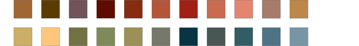
Most of the book is limited to two key colors, tan and olive. However, once I introduced all the individual casino hotels on the Las Vegas Strip, I expanded the color palette to give each resort its own identity.
The Dubai Masterplan Maps were developed by The Government of Dubai, Department of Tourism. I had to heavily customize the vector source files, and I also recolored everything digitally.
Vegas themes because she wants you to forget. Dubai is desperate for you to remember her. This series of attraction pairings demonstrate, however, demonstrates how close the aesthetics often are.
Gotham was a solid choice for neutral yet stately headers throughout. I also employed House Industries' Las Vegas Fabulous because it evokes the Rat Pack Era, and was based on the lettering for the original Flamingo Hotel logo. I set the body copy in Ron Carpenter's elegant slab-serif, Amasis.

The basic color scheme I used was a vibrant tan for Las Vegas, and a sort of date palm olive color for Dubai. The supporting palette, expanded to both warm and cool hues, I only deployed for the city maps.